Difference between revisions of "Custom Fields – General Information"
Nancy Sabo (talk | contribs) |
Nancy Sabo (talk | contribs) |
||
| Line 6: | Line 6: | ||
===Overview=== | ===Overview=== | ||
| + | This page will serve as the main repository for setup information that is shared between most field types--setup options that are specific to a certain field type will be explained on the field page itself. | ||
| + | |||
===Common Field Options=== | ===Common Field Options=== | ||
| − | Custom Fields share many of the same setup options, so we've listed them here. Please see below: | + | <!--Custom Fields share many of the same setup options, so we've listed them here. Please see below:--> |
<!-- | <!-- | ||
| − | <span class="mceNonEditable template" id="bs_template:@@@TPL1@@@" data-bs-name="FieldOptionsINFO" data-bs-type="template" data-bs-id="1">{{ FieldOptionsINFO }}</span> | + | <span class="mceNonEditable template" id="bs_template:@@@TPL1@@@" data-bs-name="FieldOptionsINFO" data-bs-type="template" data-bs-id="1"><span class="mceNonEditable template" id="bs_template:@@@TPL1@@@" data-bs-name=" FieldOptionsINFO" data-bs-type="template" data-bs-id="1"><span class="mceNonEditable template" id="bs_template:@@@TPL1@@@" data-bs-name=" FieldOptionsINFO" data-bs-type="template" data-bs-id="1"><span class="mceNonEditable template" id="bs_template:@@@TPL1@@@" data-bs-name=" FieldOptionsINFO" data-bs-type="template" data-bs-id="1">{{ FieldOptionsINFO }}</span></span></span></span> |
| − | <span class="mceNonEditable template" id="bs_template:@@@TPL2@@@" data-bs-name="DisplayINFO" data-bs-type="template" data-bs-id="2">{{ DisplayINFO }}</span> | + | <span class="mceNonEditable template" id="bs_template:@@@TPL2@@@" data-bs-name="DisplayINFO" data-bs-type="template" data-bs-id="2"><span class="mceNonEditable template" id="bs_template:@@@TPL2@@@" data-bs-name=" DisplayINFO" data-bs-type="template" data-bs-id="2"><span class="mceNonEditable template" id="bs_template:@@@TPL2@@@" data-bs-name=" DisplayINFO" data-bs-type="template" data-bs-id="2"><span class="mceNonEditable template" id="bs_template:@@@TPL2@@@" data-bs-name=" DisplayINFO" data-bs-type="template" data-bs-id="2">{{ DisplayINFO }}</span></span></span></span> |
| − | <span class="mceNonEditable template" id="bs_template:@@@TPL3@@@" data-bs-name="ValidationINFO" data-bs-type="template" data-bs-id="3">{{ ValidationINFO }}</span> | + | <span class="mceNonEditable template" id="bs_template:@@@TPL3@@@" data-bs-name="ValidationINFO" data-bs-type="template" data-bs-id="3"><span class="mceNonEditable template" id="bs_template:@@@TPL3@@@" data-bs-name=" ValidationINFO" data-bs-type="template" data-bs-id="3"><span class="mceNonEditable template" id="bs_template:@@@TPL3@@@" data-bs-name=" ValidationINFO" data-bs-type="template" data-bs-id="3"><span class="mceNonEditable template" id="bs_template:@@@TPL3@@@" data-bs-name=" ValidationINFO" data-bs-type="template" data-bs-id="3">{{ ValidationINFO }}</span></span></span></span> |
| − | <span class="mceNonEditable template" id="bs_template:@@@TPL4@@@" data-bs-name="FeatureOptionsINFO" data-bs-type="template" data-bs-id="4">{{ FeatureOptionsINFO }}</span> | + | <span class="mceNonEditable template" id="bs_template:@@@TPL4@@@" data-bs-name="FeatureOptionsINFO" data-bs-type="template" data-bs-id="4"><span class="mceNonEditable template" id="bs_template:@@@TPL4@@@" data-bs-name=" FeatureOptionsINFO" data-bs-type="template" data-bs-id="4"><span class="mceNonEditable template" id="bs_template:@@@TPL4@@@" data-bs-name=" FeatureOptionsINFO" data-bs-type="template" data-bs-id="4"><span class="mceNonEditable template" id="bs_template:@@@TPL4@@@" data-bs-name=" FeatureOptionsINFO" data-bs-type="template" data-bs-id="4">{{ FeatureOptionsINFO }}</span></span></span></span> |
| − | <span class="mceNonEditable template" id="bs_template:@@@TPL5@@@" data-bs-name="ValueStorage" data-bs-type="template" data-bs-id="5">{{ ValueStorage }}</span> | + | <span class="mceNonEditable template" id="bs_template:@@@TPL5@@@" data-bs-name="ValueStorage" data-bs-type="template" data-bs-id="5"><span class="mceNonEditable template" id="bs_template:@@@TPL5@@@" data-bs-name=" ValueStorage" data-bs-type="template" data-bs-id="5"><span class="mceNonEditable template" id="bs_template:@@@TPL5@@@" data-bs-name=" ValueStorage" data-bs-type="template" data-bs-id="5"><span class="mceNonEditable template" id="bs_template:@@@TPL5@@@" data-bs-name=" ValueStorage" data-bs-type="template" data-bs-id="5">{{ ValueStorage }}</span></span></span></span> |
--> | --> | ||
The following settings are common to nearly all [[Custom Fields|Custom Field]] types: | The following settings are common to nearly all [[Custom Fields|Custom Field]] types: | ||
| − | + | * [[#General Settings|General Settings]] | |
| − | * | + | * [[#Display & Formatting|Display & Formatting]] |
| − | * | + | * [[#Validation|Validation]] |
| − | * | + | * [[#Feature Options|Feature Options]] |
| − | * | + | * [[#Value Storage|Value Storage]] |
| − | + | {{FieldOptionsINFO}} | |
| − | + | {{DisplayINFO}} | |
| + | {{ValidationINFO}} | ||
| + | {{FeatureOptionsINFO}} | ||
| + | {{ValueStorageINFO}} | ||
<!-- | <!-- | ||
[[Image:Cf1.png]]--> | [[Image:Cf1.png]]--> | ||
| − | ===Field Name and Field ID=== | + | <!--===Field Name and Field ID=== |
* The field name is mandatory and can be up to 255 characters in length. | * The field name is mandatory and can be up to 255 characters in length. | ||
* The name should not include special characters that could be misinterpreted by the [[Browser|browser]]. | * The name should not include special characters that could be misinterpreted by the [[Browser|browser]]. | ||
| Line 32: | Line 37: | ||
<!-- | <!-- | ||
[[Image:Cf6.png]] --> | [[Image:Cf6.png]] --> | ||
| − | + | <!--<u>'''Referencing Field Names and Field IDs in other Custom Field Types'''</u> | |
| − | <u>'''Referencing Field Names and Field IDs in other Custom Field Types'''</u> | ||
You can reference fields by name or by ID in other fields. The following field types support this type of referencing: | You can reference fields by name or by ID in other fields. The following field types support this type of referencing: | ||
| Line 41: | Line 45: | ||
* '''Special''' – Calculated Value. | * '''Special''' – Calculated Value. | ||
| − | The syntax for these field types varies (some are processed on the server and other in a JavaScript in the client) and is explained for the individual field type. | + | The syntax for these field types varies (some are processed on the server and other in a JavaScript in the client) and is explained for the individual field type.--> |
| + | ==Permissions & Availability== | ||
| + | Access to a [[Custom Field|custom field]] is controlled by permissions. These can be found and set in any custom field, on the Permissions and Availability tab. You can set only certain roles to be able to see/edit a field, or you can do the same thing with statuses. An example would be denying the Applicant role permission to see the Decision custom field. | ||
| + | See [[Role Field Permissions]] or [[Status Field Permissions]] for more information. | ||
<!--<u>'''Special Field Name Syntax'''</u> | <!--<u>'''Special Field Name Syntax'''</u> | ||
| Line 54: | Line 61: | ||
* A '''@''' sign can be used with the built-in field Location in the [[Universal Tracking Application]] to connect the field to the [[User|user’s]] selected mapping service. | * A '''@''' sign can be used with the built-in field Location in the [[Universal Tracking Application]] to connect the field to the [[User|user’s]] selected mapping service. | ||
--> | --> | ||
| − | <u>'''Field Type'''</u> | + | <!--<u>'''Field Type'''</u> |
The field type is used to define the characteristics of the field. There are over '''50''' field types currently available. | The field type is used to define the characteristics of the field. There are over '''50''' field types currently available. | ||
===[[display order|Display Order]]=== | ===[[display order|Display Order]]=== | ||
| Line 78: | Line 85: | ||
||Categories | ||Categories | ||
|- | |- | ||
| − | ||UTA {{l1}} Entities | + | ||UTA <span class="mceNonEditable template" id="bs_template:@@@TPL11@@@" data-bs-name="l1" data-bs-type="template" data-bs-id="11">{{ l1 }}</span> Entities |
||UTA Level 1 Template Entities | ||UTA Level 1 Template Entities | ||
|} | |} | ||
| Line 88: | Line 95: | ||
* [[Field Data]] - displays all the values that have been saved to the field. | * [[Field Data]] - displays all the values that have been saved to the field. | ||
| − | * [[Update History]] - displays all the updates to field settings. | + | * [[Update History]] - displays all the updates to field settings.--> |
<!--* [[Custom Field Language Settings|Language Setting]] - --> | <!--* [[Custom Field Language Settings|Language Setting]] - --> | ||
| − | * Search Reference - displays all locations where the custom field is referenced in the system. | + | <!--* Search Reference - displays all locations where the custom field is referenced in the system. |
===Tab Name=== | ===Tab Name=== | ||
| Line 96: | Line 103: | ||
* The tab name can be any text string. | * The tab name can be any text string. | ||
* Custom fields that are not associated with a tab will be displayed on a tab named Default. | * Custom fields that are not associated with a tab will be displayed on a tab named Default. | ||
| − | * The Tab Name option appears once the Advanced Options are enabled, on the Classic Options tab. | + | * The Tab Name option appears once the Advanced Options are enabled, on the Classic Options tab.--> |
<!-- | <!-- | ||
====Fields with No Tab Set==== | ====Fields with No Tab Set==== | ||
| Line 110: | Line 117: | ||
See [[Visibility Condition]] for more information. | See [[Visibility Condition]] for more information. | ||
| + | ==Classic Options== | ||
| + | ===Common Custom Field Settings=== | ||
| + | Each custom field contains buttons at the top that link to the following functions: | ||
| + | * [[Field Data]] - displays all the values that have been saved to the field. | ||
| + | * [[Update History]] - displays all the updates to field settings. | ||
| + | * Search Reference - displays all locations where the custom field is referenced in the system. (see '''Custom Field References''', farther down this page.) | ||
| − | === | + | ===Tab Name=== |
| − | + | * If you add a text value to the tab Name, the field will be displayed on that tab. | |
| − | + | * The tab name can be any text string. | |
| − | + | * Custom fields that are not associated with a tab will be displayed on a tab named Default. | |
| + | * The Tab Name option appears once the Advanced Options are enabled, on the Classic Options tab. | ||
<!-- | <!-- | ||
[[Image:Cf8.png]] --> | [[Image:Cf8.png]] --> | ||
Revision as of 16:23, 11 October 2018
 Please note that this page is currently under construction. There is more information to come. Please note that this page is currently under construction. There is more information to come.
|
Contents
General Description
A custom field is created on an as-needed basis, and is associated with a SmartSimple entity such as a contact, company, role, or activity. These fields can be accessed and controlled via links on the Global Settings page or on the Entity Settings Page within a UTA. New custom field types are added on a regular basis, so check the upgrade notes in the Wiki for the latest field types.
Overview
This page will serve as the main repository for setup information that is shared between most field types--setup options that are specific to a certain field type will be explained on the field page itself.
Common Field Options
The following settings are common to nearly all Custom Field types:
General Settings
The General Settings will appear right when you open up a Custom Field to edit.

| Option | Description | Format |
|---|---|---|
| Custom Field ID | The unique ID number associated with the custom field.
|
Not Applicable |
| Field Type | The list of available Field Types.
|
@fieldtype@ |
| Field Name | The name of the field, used internally to reference the user's input;
|
@fieldname@ |
| Caption | The leading question or prologue before the field.
|
@caption@ |
| Display Order | The order (relative to other fields) in which this field is displayed.
|
@displayorder@ |
| Description | Definition and general description of the custom field. Will not be displayed. | @description@ |
Display Order with Related Entities
If you add custom fields to the basic contact entity and then add fields to roles associated with contacts, you will need to take care, as the fields will become mixed if they have the same number sequence.
The following table outlines where you need to be careful:
| Entity | Related Entity |
|---|---|
| Contact | Roles |
| Companies | Categories |
| UTA Level 1 Entities | UTA Level 1 Template Entities |
You should start the number sequence for these types of related fields at some higher level. For example, role 1 starts at 5000, role 2 starts at 8000.
Display & Formatting
The Display & Formatting section of Custom Fields are found by scrolling down the first tab of General Settings when you edit a Custom Field.

| Option | Description |
|---|---|
| Caption Location |
Determines the positioning and visibility of the caption relative to the field. Options include: Left of Field, Above Field, No Caption, Hide Caption.
|
| Instructions | Text input here displays under the caption. Even if a caption has Hide Caption enabled, any defined instructions will continue to be displayed above the input. |
| Placeholder Text |
Text input here displays within the text box as placeholder text that will disappear once the user clicks into the field to enter content.
|
| Tool Tip | When the user hovers their mouse pointer over the question mark next to a field, the text in this section will appear. |
| Classify as Personal Data | For use in identifying personal data. |
| SmartField View | Include or exclude this field from SmartField View (@SmartFields@) or only display this field for SmartField Views. See SmartField View for further details. |
| SmartFields PDF Formatting | PDF formatting option when rendered from SmartField View. |
| Width / Max Width | Width of input box - options include Full, Large, Medium, Small. |
| Number of Columns | Determines the number of columns to be used for display purposes. |
| Align | Control the justification of the text within the field - Left, Center, Right. |
| Number Format | Control the format of the data when the field is displayed in View mode - for example, Comma, Currency, or Percent. |
| Number Precision | Control the precision of the numerical amount displayed - for example, Whole Number, x number of Decimals, or Nearest Ten. |
| Thumbnail Width | Determines the width of the image's thumbnail, in pixels. |
| Thumbnail Height | Determines the height of the image's thumbnail, in pixels. |
| Sort Order | Sets the sorting order for files uploaded to the field. Choices are: file name, file size and upload date. |
| Stroke Colour | Allows you to set the color of the stroke. |
| Button Label | Specify what a custom button will be called. |
| Apply Format in Edit Mode | Carry over the field data formatting in Edit mode. |
| Fixed Column Widths | Establishes a uniform width, if multiple columns are specified. Used with Layout fields. |
Validation
The Validation section is under the General Settings tab and looks similarly to this:

| Option | Description |
|---|---|
| Mandatory | Selecting this option means that this field is required and must be completed. |
| Appear Mandatory | Makes the field appear as though it is a required field. Typically used in conjunction with browser scripts, JavaScript Validation or Submit Logic that perform validation. The field from a user perspective will normally appear with a red asterisk (*) in order to indicate that the field is mandatory. |
| Custom Validation | Specify validation based on Javascript syntax. |
| Failed Validation Message | Input the message that will be displayed if validation fails. |
| Minimum Length | Input the lowest required amount of characters as a restriction on the user's input into the field; they must insert at least this minimum of characters in order for the field to be successfully validated. A good use-case for this would be a minimum of 9 characters for a mandatory Phone Number field. |
| Maximum Length | Input the highest allowed amount of characters as a restriction on the user's input into the field. They must insert less than this maximum of characters (and, if required, more than the minimum) in order for the field to be successfully validated. A good use-case for this would be a maximum of 6 characters for a Postal Code field for a Canadian address. |
| Show Counter | Toggling on this option will enable a counter that counts down the number of characters that are available for the user to input before reaching the maximum. It will also display if the user has exceed the maximum by going into negative digits. |
| Show Words | Toggling on this option will enable the maximum and minimum lengths, if inputted, to be restricted by the amount of individual words rather than characters. |
| Exceeded Maximum Message | Toggling on either Show Counter or Show Words will open this option. Insert the text that you want to be displayed to the user if they exceed the maximum length for either characters or words. |
Feature Options
The Feature Options section of Custom Fields settings is also found under the General Settings tab when you are editing a Custom Field. The Feature Options section will look something like this:

| Option | Description |
|---|---|
| Track Changes | Enables the logging of all changes to any specified Custom Fields or Standard Fields within the system, including within a Universal Tracking Application, contact, company or transaction record. |
| Show Display Value in List Views | Enabling this option will display the display value; by default, the stored value is shown when fields are referenced in List Views. |
| Enable Multiple Select | Enables users to select multiple values from the listed values. |
| Enable Map Service | Displays the map icon next to the field name. This icon will launch the user’s selected map service and display a map of the content of the field – provided a valid address is stored in the field. |
| Enable Translation Service | Allows for language translation of data entered into text fields, achieved by integration with Google Translate. |
Value Storage
The Value Storage section is the final area of General Settings when editing a Custom Field. It will look like this:

| Option | Description |
|---|---|
| From Custom Field(s): | Displays the name of the source field that the current field is pulling data from; refer to Value Stores To. |
| To Custom Field: | The field that this field will be sending data to; refer to Value Stores To. |
Permissions & Availability
Access to a custom field is controlled by permissions. These can be found and set in any custom field, on the Permissions and Availability tab. You can set only certain roles to be able to see/edit a field, or you can do the same thing with statuses. An example would be denying the Applicant role permission to see the Decision custom field.
See Role Field Permissions or Status Field Permissions for more information.
Visibility Condition
Whether or not a custom field is visible can be controlled using conditional statements in this box. (Appears on the Permissions and Availability tab, once the Advanced Options are enabled.)
See Visibility Condition for more information.
Classic Options
Common Custom Field Settings
Each custom field contains buttons at the top that link to the following functions:
- Field Data - displays all the values that have been saved to the field.
- Update History - displays all the updates to field settings.
- Search Reference - displays all locations where the custom field is referenced in the system. (see Custom Field References, farther down this page.)
Tab Name
- If you add a text value to the tab Name, the field will be displayed on that tab.
- The tab name can be any text string.
- Custom fields that are not associated with a tab will be displayed on a tab named Default.
- The Tab Name option appears once the Advanced Options are enabled, on the Classic Options tab.
Custom Field References
This feature is intended to help determine the impact of a custom field change by highlighting where the custom field is referenced within the system. Each Custom field has a Search Reference--this button is found in the action bar, and can be identified by the magnifying glass icon.
When used, the feature will search references to this custom field via variable syntax in various areas, including:
- Other custom field options/visibility condition, including JavaScript Validation, Visibility Condition, calculated values, etc.
- Template formulas
- Submit buttons
- Submit Logic
- SmartCheck Validation
- Workflow Task
- Workflow connectors
- Data class policy

Import and Export Custom Fields
You can use the custom field Import and Export features to move or copy custom fields from one entity to another (or even another instance of SmartSimple). The custom fields are exported and importing by using XML format.
To export a block of custom fields, simply click the Export button at the top of a list of custom fields. A window will pop up showing the custom field settings in XML format:
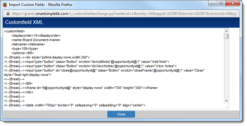
The XML block for the entire set of custom fields in the list will be displayed. Individual custom fields are delineated by the tags. Simply copy the block of custom fields you want to copy (you can make edits, e.g. to the display order in a text editor), click on the Import button at the top of the list of custom fields where you want to place the new fields, paste the XML block into the blank text area, and confirm that you want to import the fields by clicking Import at the bottom of the Import pop-up.
The majority of field settings will be included in the copied fields. Exceptions include:
- any Field Permissions
- any Field Permission Matrix assigned to the original custom field
- any Value Stores To setting assigned on the original custom field
- the Description setting
However, Field Permissions and Field Permission Matrices can be assigned to the new fields using the Batch Update feature.
As the custom field ID is unique to each custom field in the system, the custom field IDs will not be copied. Any newly created custom fields using the Export/Import feature will be assigned new custom field IDs.
Also see Custom Field Import Wizard
Custom Field Types
The full list of Custom Field Types can be found on the Custom Field Types page.