Difference between revisions of "Custom Field Type: Select One – Combo Box"
| Line 13: | Line 13: | ||
[[Image:cf_socb_ex2.png]]<br /> | [[Image:cf_socb_ex2.png]]<br /> | ||
| − | '' '''Select One - Combo Box''' field, in ''' | + | '' '''Select One - Combo Box''' field, in '''View Mode''' (above)'' |
Revision as of 12:40, 1 March 2016

Contents
General Description
Displays as a set of values in a combo box. The user can select a single value. The size of scrolling window is controlled by the Height Setting.
Field Display

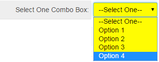
Select One - Combo Box field, in Edit Mode (above)
![]()
Select One - Combo Box field, in View Mode (above)

Setting the values for the Select One - Combo Box field, in General Settings (above)
Field Options
| Option | Description | Format |
|---|---|---|
| Custom Field ID | The unique ID number associated with the custom field. | Not Applicable |
| Field Type | The list of available Field Types. | @fieldtype@ |
| Field Name | The name of the field, used internally to reference the user's input; | @fieldname@ |
| Caption | The leading question or prologue before the field. | @caption@ |
| Display Order | The order (relative to other fields) in which this field is displayed. | @displayorder@ |
| Description | Definition and general description of the custom field. Will not be displayed. | @description@ |
- Parent Field - See Conditional Lists of Values page.
- Values: The values to be used for each check box delimited by a semi-colon with no spaces
- Tool Tip: When the user hovers their mouse pointer over the caption of a field, the text in this section will appear.
- On New Record: Controls how the field should be displayed until record has been saved once.
- Always Display: Field will be exposed both before and after the record is saved.
- Hide on New Record: Field will be hidden until record is saved.
- Only Show on New Record: Field will be exposed until record is saved, and then it will be hidden. This option is useful for fields that provide instructions for filling out forms before saving.
- SmartField View - Include or exclude this field from SmartField Views (@SmartFields@) or only display this field for SmartField Views. See SmartField View for further details.
Options
General Options
- Mandatory: Selecting this option means that this field is required and must be completed.
- Appear Mandatory: Makes the field appear as though it is a required field. Typically used in conjunction with browser scripts, JavaScript Validation or Submit Logic that perform validation.
- Searchable: This field can be searched within the tracking application.
- Track Changes: Keeps track of changes made to this field.
- Enable Multiple Select: Enables users to select multiple values from the listed values.
- Show Display Value in List Views: By default, the stored value is shown when fields are referenced in List Views. Selecting this option will display the display value.
- Show as Radio Buttons: Values will be displayed as radio buttons, rather than check boxes.
Enable KML: Used to upload a KML file which is used to display geographic data on a map.
- Disable Quick Edit: Disables this field from being selectable in Quick Edit on a List View.
- Disable Field From Global Search: Selecting this option means that the contents of this field will not be displayed in Global Search results.
Validation
| Option | Description | Format |
|---|---|---|
| Mandatory | Selecting this option means that this field is required and must be completed. | Not Applicable |
| Appear Mandatory | Makes the field appear as though it is a required field. Typically used in conjunction with browser scripts, JavaScript Validation or Submit Logic that perform validation. | Not Applicable |
| Custom Validation | - | Not Applicable |
| Failed Validation Message | Message displayed if validation fails. | Not Applicable |
Formatting
- Caption Style: Add caption styling by including HTML style tags around @value@
- Width: Enables the user to set the width of the Lookup field in pixels
- Custom HTML Tag: Use this field for additional attributes to the field HTML tag.
Value Storage
- Value Storage: Enables linking two different custom fields to the same user data. See Value Stores To page.
Permissions & Availability Tab
- Visibility Condition: See the Visibility Condition Wiki page.
- Field Permission Matrix: See the Field Permission Matrix Wiki page.
- Role - Field Permissions: These settings allow you to control by Role who is allowed to view and/or modify the field.
- Status - Field Permissions: These settings allow you to control by the Status of the record whether or not the field can be viewed and/or modified. (Only present within the Universal Tracking Application)
- Type - Field Permissions: These settings allow you to control by the template of the record whether or not the field can be viewed and/or modified. (Only present within the Universal Tracking Application)
Referencing the Value
- @fieldname@
- @fieldname.combovalue@
or
- @#fieldid#@
- @#fieldid.combovalue#@
When trying to reference the values of this custom field type, you must use @fieldname@ or @fieldname.combovalue@, depending on how the field is setup. Typically, you can use @fieldname@ but there is a special case where you must use @fieldname.combovalue@ when the values in the combo box are 1=Yes;2=No;3=Maybe.
Using @fieldname@ will return the Yes, No, or Maybe. But using @fieldname.combovalue@ will return 1, 2, or 3.
Using @fieldname.value@ will display the full HTML of the field; in other words, a dropdown box containing the values of the field will be displayed.
Notes
The best practice when creating a combo box with a --Select One--is to use store-value=display-value syntax with a space as the stored value:
=--Select One--;Option 1;Option 2;Option 3;Option 4
This ensures that the database won't store the value "--Select One--" which may cause security issues based on specific security settings.
If you want the value stored in a Dropdown List field to be different from what is displayed in the combo box, you can use the following syntax in the Values section of the custom field settings:
StoreValue1=DisplayValue1;StoreValue2=DisplayValue2;StoreValue3=DisplayValue3;
- The value before the equals sign, known as the stored value, will be stored.
- The value after the equals sign, known as the display value, is what will be displayed in the combo box (or check boxes), but does not get saved.
By default, the stored value is shown when fields are referenced in List Views. Selecting the Show Display Value in List Views option in the custom field settings will display the display value.
- The first value listed will be the default value when a new record is created.
- This technique is important when translating to other languages. The StoreValue must be the same in all languages. See here for further information.
Allow Empty
- Because the values in a Combo Box Custom Field are restricted to the semi-colon delimited list in the Values field, the Allow Empty field has a slightly different behaviour than usual. It controls whether or not the record can be saved with the default value (which is the first value listed in the Values section):
- If Allow Empty is checked, the record can be saved with the default value.
- If Allow Empty is not checked, the record cannot be saved with the default value. In this way you can force the user to select a value different from the default value.
- Important: Because the record cannot be saved with the default value, the first item listed in the Value section should be either a space followed by a semi-colon (if you want the field to start out blank) or an instruction to the user such as -----Select One-----; Please choose; or similar. You do not want an actual value as the first item, since the record can never be saved with the first value if Allow Empty is deselected.
Retired Options
If you need to hide options which are no longer being used but need to be retained for historical value, you can use the following syntax:
<ssRetiredOptions> </ssRetiredOptions>
Make sure there are semi-colons before and after the syntax.
Example: 1;2;3;<ssRetiredOptions>5;6</ssRetiredOptions>;7;8
When using this method, the retired options must not be the first options in the list. If the first option(s) in the list are to be retired, simply move them to the end of the list so that Option1;Option2;Option3 becomes Option2;Option3;<ssRetiredOptions>Option1</ssRetiredOptions>;