Difference between revisions of "Profile"
(→Overview) |
(→Overview) |
||
| Line 6: | Line 6: | ||
The menu icon: | The menu icon: | ||
| − | {{Icon-Menu}} | + | :: {{Icon-Menu}} |
Profile access from the main menu: | Profile access from the main menu: | ||
| − | :: | + | :: [[File:Accessing profiles.png|200px|border]] |
| − | |||
===Example of Contact Profile Page=== | ===Example of Contact Profile Page=== | ||
There are different components to a [[User|user's]] profile page: a left-hand side menu, their main contact information, their [[User Role|roles]], and properties. | There are different components to a [[User|user's]] profile page: a left-hand side menu, their main contact information, their [[User Role|roles]], and properties. | ||
Revision as of 10:46, 24 June 2019
Contents
Overview
Both contact and organization records have profile pages, which can be configured by system administrators to contain custom and standard fields.
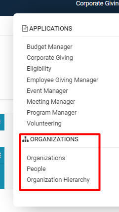
Each type of profile can be accessed from anywhere in the system by either clicking a hyperlinked Name of the organization or user, or directly from the People, Organization, or Organization Hierarchy pages from the 9-square menu icon and under the heading Organizations.
The menu icon:
Profile access from the main menu:
Example of Contact Profile Page
There are different components to a user's profile page: a left-hand side menu, their main contact information, their roles, and properties.
- Note: The left-hand side menu will contain different tabs depending on the user.
- Find out more about Notes on our Wiki page.
Contact Information
The main information displayed in a user's profile includes their Name, Role, Email Address, Profile Picture, and any other Standard Fields or Custom Fields that are filled out when editing the user's profile.
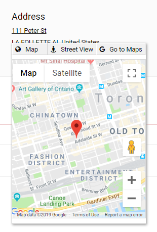
The Address field, displayed on the right-hand side of the profile, is clickable into an interactive map option integrated with Google Maps. You also have the option to go into Street View or to Go to Google Maps in a separate tab that will open up.
In the same area as you see the Address will be two other buttons that you can toggle between to access different information related to the user.
The three line icon will open up Properties related to the specific user, including a time and date stamp for Last Login, Last Updated, and Created Date as well as the names of those who updated and created the user respectively.
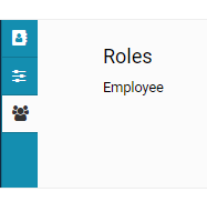
Underneath the Properties icon is a three person button that will list the role(s) that the user has been organized under.
-
- See the User Role page for more information such as creating new roles, adding and/or removing users from roles. See the Roles and Security Settings page for more information about SmartSimple's role-based security and the accessibility of certain roles to SmartSimple features.
At the top of the page, above the Name displayed of the user, are the following buttons:
| Back Button | The left arrow will bring you back to the last page that you visited. The drop down button next to this will enable a list of recently visited pages, which you can go through and directly click on to easily bring you to previous pages. |
| New Button |
The new button will enable a drop down of New functions. On a user profile, this will include adding new users and activities. On an organization profile, this will include options to import or add new users, organizations, and activities. |
| Edit |
The Edit button enables you, if you have permission (normally must be in a System Administrator role), to Edit the details of the user's profile, including the information filled out for standard and custom fields, their organization associations, and so on.
|
| Options |
The Options button has a drop down of available functions, some of which will only be available to those in SysAdmin role.
Note that Configuration Mode will only appear under the Options button when you are in Edit Mode.
|
On the top right of the user's profile information are four other buttons:
| Key Icon - Activate/Deactivate a User | Clicking this button will allow a SysAdmin to either activate or deactivate a User. If the icon is greyed out, the user is deactivated - they will be unable to login to SmartSimple even with the correct credentials. The same key icon appears next to user names on the organization hierarchy and can be used to easily activate a user. |
| Lock Icon - Personal Data Processing Information | Clicking this button will open a modal window that explains the usage of Email and Office Telephone information (Personal Data Processing Information). |
| Star Icon - Add to SmartCard | Clicking this button will allow you to add this user to a SmartCard. |
| Double Square Icon - Enable Dock | Clicking this button will switch your viewing access into a split-screen mode, in which the left-hand side menu tabs will be "docked" on the right of the page, while the profile is displayed on the left. You may close this split-screen mode at any time by clicking the X icon. |
Example of Organizational Profile Page
There are different components to an organization's profile page: a left-hand side menu, the main contact information for the organization, the category or categories to which the organization belongs, and the organization properties.
Organization Information
The main information on the organization profile will display the Organization Name, Website, Phone Number, and Primary Office Address.


