Difference between revisions of "Submit & Save Buttons"
| Line 27: | Line 27: | ||
|- | |- | ||
||'''Type''' | ||'''Type''' | ||
| − | ||Type options include Submit Button, Save Button, Save Draft Button, and Submit Annotation. See Submit Logic on Save or Save Draft Buttons for further information. | + | ||Type options include Submit Button, Save & Validate Button, Save Draft Button, and Submit Annotation. See Submit Logic on Save or Save Draft Buttons for further information. |
|- | |- | ||
||'''Order''' | ||'''Order''' | ||
| Line 36: | Line 36: | ||
|- | |- | ||
||'''Icon Style''' | ||'''Icon Style''' | ||
| − | ||These are the various groups of icons including '''Brands''', which features brand logos, '''Light''', which contains outline-style icons with light line weights, '''Regular''', which includes outline-style icons with heavier line weights, and '''Solid''', which includes monochromatic glyphs with solid fills. | + | ||These are the various groups of icons including '''Brands''', which features brand logos, '''Light''', which contains outline-style icons with light line weights, '''Regular''', which includes outline-style icons with heavier line weights, and '''Solid''', which includes monochromatic glyphs with solid fills. |
|- | |- | ||
||'''Icon''' | ||'''Icon''' | ||
| − | ||Graphic icons can be featured on Submit & Save button to clarify and reiterate the purpose of the button. Simply select the icon group using the '''Icon Style''' dropdown, and then use the '''Icon''' dropdown to select the desired icon. | + | ||Graphic icons can be featured on Submit & Save button to clarify and reiterate the purpose of the button. Simply select the icon group using the '''Icon Style''' dropdown, and then use the '''Icon''' dropdown to select the desired icon. |
|- | |- | ||
||'''Description''' | ||'''Description''' | ||
| Line 50: | Line 50: | ||
||The statuses in which the button will appear. This will be the status that the record is in before being submitted to the subsequent status that the button directs to. | ||The statuses in which the button will appear. This will be the status that the record is in before being submitted to the subsequent status that the button directs to. | ||
|- | |- | ||
| − | ||''' | + | ||'''Submit to Status''' |
| − | || | + | ||This is the status that the entity should be updated to after clicking on the button. Use this dropdown to select the destination status of the submit button. |
| + | |- | ||
| + | ||'''SmartCheck Validation''' | ||
| + | ||Select the [[SmartCheck Validation]] method required for the button. This is used to attach custom validation conditions to this button, prohibiting users from proceeding without meeting the custom [[SmartCheck Validation]] conditions specified. | ||
| + | |- | ||
| + | ||'''Bypass Field Validation''' | ||
| + | ||Flag to indicate that the status should change without the system performing all field validations (bypassing fields marked as Mandatory). The Submit Logic on the button itself will still be validated. | ||
| + | |- | ||
| + | ||'''Custom Script''' | ||
| + | ||Include any custom scripts here that will be executed when the button is clicked. | ||
| + | |- | ||
| + | ||'''Enable Confirmation Alert Message''' | ||
| + | ||Toggle this on to enable an alert message which appears when clicking the button, asking the user if they are sure that they would like to proceed. | ||
| + | |- | ||
| + | ||'''Confirmation Message''' | ||
| + | ||This field only appears if a Confirmation Alert Message are enabled. Here, enter the messaging that you would like to appear on the alert message. | ||
| + | |- | ||
| + | ||'''Enable Confirmation Page''' | ||
| + | ||Toggle this on to create a Confirmation Page which the user is directed to after clicking the submit button. The contents of this page are determined by the subsequent options which appear. | ||
| + | |- | ||
| + | ||'''Title''' | ||
| + | ||This field only appears if the Confirmation Page is enabled. The title specified here will be the title which appears at the top of the Confirmation Page. | ||
| + | |- | ||
| + | ||'''Message''' | ||
| + | ||This field only appears if the Confirmation Page is enabled. The message specified here will be the body content of the Confirmation Page. | ||
| + | |- | ||
| + | ||'''Redirect URL''' | ||
| + | ||Specify the URL the user should be redirected to following successful submission. NOTE: Redirects must be relative path (e.g. /wiki/index.php) rather than an absolute path (e.g. http://www.smartsimple.org/wiki/index.php). | ||
| + | |- | ||
| + | ||'''Button Caption''' | ||
| + | ||This field only appears if the Confirmation Page is enabled. The caption specified here will be included on the button which is featured on the Confirmation Page. Typically, this would be a link back to the user's home portal. | ||
| + | |- | ||
| + | ||'''Button Icon Style''' | ||
| + | ||This field only appears if the Confirmation Page is enabled. This determined the style of the icon included in the button featured on the Confirmation Page. These are the various groups of icons including '''Brands''', which features brand logos, '''Light''', which contains outline-style icons with light line weights, '''Regular''', which includes outline-style icons with heavier line weights, and '''Solid''', which includes monochromatic glyphs with solid fills. | ||
| + | |- | ||
| + | ||'''Button Icon''' | ||
| + | ||This field only appears if the Confirmation Page is enabled. Icons selected from this dropdown will be included in the button featured on the Confirmation Page. | ||
| + | |- | ||
| + | ||'''Redirect Payment Form''' | ||
| + | ||After clicking the button, the user will be redirected to the payment form selected here. | ||
|} | |} | ||
| − | + | ===Permissions & Availability Settings=== | |
| − | + | The '''New Submit & Save Button''' page, '''Permissions & Availability''' tab includes the following settings: | |
| − | |||
| − | |||
| − | |||
| − | |||
| − | |||
| − | |||
| − | |||
| − | |||
| − | |||
| − | |||
| − | |||
| − | |||
| − | |||
| − | |||
| − | |||
| − | |||
| − | |||
| − | |||
| − | |||
| − | |||
| − | |||
| − | |||
| − | |||
| + | {| class="wikitable" | ||
| + | |- | ||
| + | !|Setting | ||
| + | !|Description | ||
| + | |- | ||
| + | ||'''Role - Permissions''' | ||
| + | ||Specify which roles have access to the button. Toggling on '''Use UTA Role''' will include role-based permissions for users assigned in UTA Roles. | ||
| + | |- | ||
| + | ||'''Type - Availability''' | ||
| + | ||Specify which record types the button will appear on. | ||
| + | |- | ||
| + | ||'''Visibility Condition''' | ||
| + | ||Enter custom visibility conditions for the button here. | ||
| + | |- | ||
| + | ||'''On New Record''' | ||
| + | ||define how the Submit Button will be displayed on a new record. Options include '''"Always Display", "Hide on New Record", "Only Show on New Record"'''. | ||
| + | |} | ||
5) Click '''Save''' once you have configured the Submit button. | 5) Click '''Save''' once you have configured the Submit button. | ||
Revision as of 12:41, 15 October 2021
Contents
Overview
SmartSimple offers the ability to define multiple submit buttons against individual statuses within a UTA.
The buttons can also be configured so that they are presented to subsets of users, perform certain validation checks and can push the event to a specific status.
Configuration - Essentials
Create a Submit Button
To create a Submit Button:
- Navigate to the UTA which you'd like to add your Submit button to.
- Click the Configuration Settings button within the UTA.
- If you'd like to add a submit button to a Level 1 entity, select the second tab, which contains your Level 1 settings. If you'd like to add a submit button to a Level 2 Entity, select the third tab, which contains your Level 2 settings, and so on.
- Click on the Submit & Save Buttons link under the General Settings header.
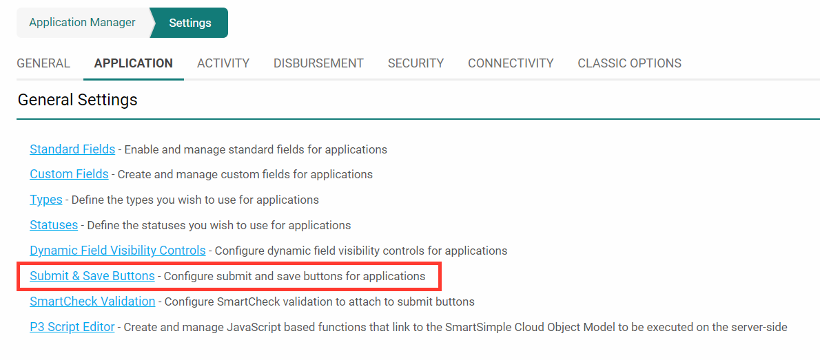
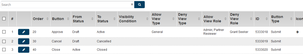
- The Submit & Save Buttons page is displayed.
- Click on the New Submit & Save Button button, signified by the + sign.
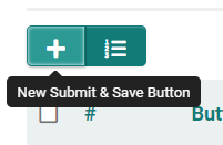
- You will be presented with a new window, titled New Submit & Save Button where you can configure the submit button.


New Submit & Save Button Page - Settings
The New Submit & Save Button page includes the following settings:
| Setting | Description |
|---|---|
| Type | Type options include Submit Button, Save & Validate Button, Save Draft Button, and Submit Annotation. See Submit Logic on Save or Save Draft Buttons for further information. |
| Order | This is the order in which the button will appear on the screen, with lower numbers appearing further to the left of the screen. |
| Caption | This is the text that will appear on the button. Typically, you would name the button after the action that is triggered by the button. Example: If a button sends applications into Approved status, we will give it the caption "Approved". |
| Icon Style | These are the various groups of icons including Brands, which features brand logos, Light, which contains outline-style icons with light line weights, Regular, which includes outline-style icons with heavier line weights, and Solid, which includes monochromatic glyphs with solid fills. |
| Icon | Graphic icons can be featured on Submit & Save button to clarify and reiterate the purpose of the button. Simply select the icon group using the Icon Style dropdown, and then use the Icon dropdown to select the desired icon. |
| Description | Definition and general description of the submit button. This will not be displayed on the button. |
| Align to | Select the preferred alignment of the button at the bottom of the window (Center, Left, Right). |
| Available to Status | The statuses in which the button will appear. This will be the status that the record is in before being submitted to the subsequent status that the button directs to. |
| Submit to Status | This is the status that the entity should be updated to after clicking on the button. Use this dropdown to select the destination status of the submit button. |
| SmartCheck Validation | Select the SmartCheck Validation method required for the button. This is used to attach custom validation conditions to this button, prohibiting users from proceeding without meeting the custom SmartCheck Validation conditions specified. |
| Bypass Field Validation | Flag to indicate that the status should change without the system performing all field validations (bypassing fields marked as Mandatory). The Submit Logic on the button itself will still be validated. |
| Custom Script | Include any custom scripts here that will be executed when the button is clicked. |
| Enable Confirmation Alert Message | Toggle this on to enable an alert message which appears when clicking the button, asking the user if they are sure that they would like to proceed. |
| Confirmation Message | This field only appears if a Confirmation Alert Message are enabled. Here, enter the messaging that you would like to appear on the alert message. |
| Enable Confirmation Page | Toggle this on to create a Confirmation Page which the user is directed to after clicking the submit button. The contents of this page are determined by the subsequent options which appear. |
| Title | This field only appears if the Confirmation Page is enabled. The title specified here will be the title which appears at the top of the Confirmation Page. |
| Message | This field only appears if the Confirmation Page is enabled. The message specified here will be the body content of the Confirmation Page. |
| Redirect URL | Specify the URL the user should be redirected to following successful submission. NOTE: Redirects must be relative path (e.g. /wiki/index.php) rather than an absolute path (e.g. http://www.smartsimple.org/wiki/index.php). |
| Button Caption | This field only appears if the Confirmation Page is enabled. The caption specified here will be included on the button which is featured on the Confirmation Page. Typically, this would be a link back to the user's home portal. |
| Button Icon Style | This field only appears if the Confirmation Page is enabled. This determined the style of the icon included in the button featured on the Confirmation Page. These are the various groups of icons including Brands, which features brand logos, Light, which contains outline-style icons with light line weights, Regular, which includes outline-style icons with heavier line weights, and Solid, which includes monochromatic glyphs with solid fills. |
| Button Icon | This field only appears if the Confirmation Page is enabled. Icons selected from this dropdown will be included in the button featured on the Confirmation Page. |
| Redirect Payment Form | After clicking the button, the user will be redirected to the payment form selected here. |
Permissions & Availability Settings
The New Submit & Save Button page, Permissions & Availability tab includes the following settings:
| Setting | Description |
|---|---|
| Role - Permissions | Specify which roles have access to the button. Toggling on Use UTA Role will include role-based permissions for users assigned in UTA Roles. |
| Type - Availability | Specify which record types the button will appear on. |
| Visibility Condition | Enter custom visibility conditions for the button here. |
| On New Record | define how the Submit Button will be displayed on a new record. Options include "Always Display", "Hide on New Record", "Only Show on New Record". |
5) Click Save once you have configured the Submit button.
6) The Submit button will be listed in the Submit Buttons section.
Field Permissions
Submit and Save buttons can be configured to control when a button is visible or not visible based on Type - Field Permissions and Role - Field Permissions using the Allow View and Deny View settings.
Notes
You can use the URL to display a Web Page View as a confirmation page. Use the following syntax: @custom field name.value@
The Submit Annotation type button will only appear on the record if it is under Status lock. This button type is used to submit field modifications and will stamp the revision log with changes.
See Also
- Submit Logic
- Status
- Template / Type Formula - for more examples of syntax to be used
- savefunc or sbfunc
- Obtain Server Date and Time
- Field Permissions
- Custom Save and Save Draft Buttons