Difference between revisions of "Configuring List Views"
From SmartWiki
(→The Properties Tab) |
(→The Columns Tab) |
||
| Line 44: | Line 44: | ||
* When you first click on this tab, you will see the default four blank columns. | * When you first click on this tab, you will see the default four blank columns. | ||
<BR><br> | <BR><br> | ||
| − | [[Image: | + | [[Image:Listviewblankcolumnsshort2.PNG|link=]] |
Revision as of 09:21, 7 May 2014
 Click here to watch a video on creating and editing List Views.
Contents
Defining a List View
There are two types of List Views: System Views and Personal Views.
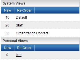
- System Views belong to a specific role. All users in that role will have the option to select this List View. Multiple System Views can be defined for each role.
- Personal Views are only visible to the user who creates them. Multiple Personal Views can be defined for each user.
System Views
- When you click on the "New" button in the System View section, you will be prompted to select the role to which the System View pertains.
- Select the appropriate role, enter a name for the list view and click "OK."
- You will now see four tabs in the right-hand frame: Properties, Columns, Sort Order and Export.
Personal Views
- When you click on the "New" button in the Personal View section, the only difference from System Views will be that you will not have the option to select a role.
- Enter a name for the list view and click "OK."
- You will now see four tabs in the right-hand frame: Properties, Columns, Sort Order and Export.
The Properties Tab
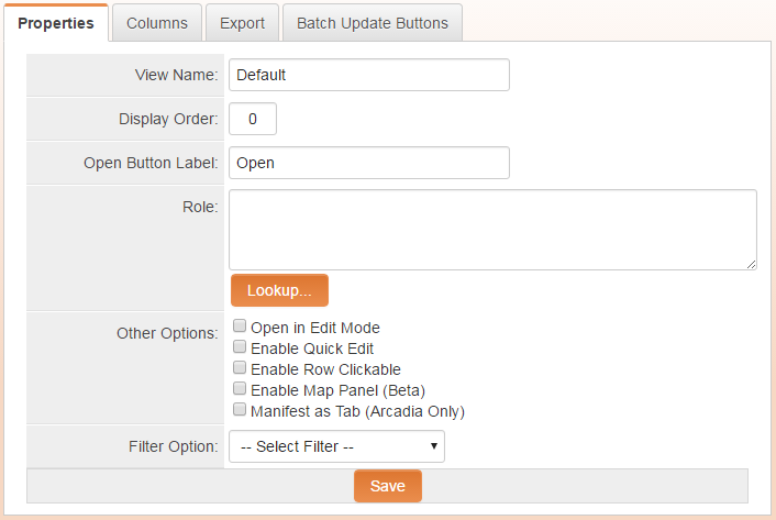
- View Name - The name of the list view is editable. Give your list view a distinctive name.
- Display Order - Enter a display order. This will define which list view will be the default for users who possess multiple roles. List views with lower display orders will be displayed before those with higher display orders.
- Open Button Label - The default value for the "Open Button Label" is "Open." Changing this value will change the caption on the button used to access a specific record in the list view.
- Role - The Role dropdown will be available only for System Views (see above). The list view can be made available for all roles by selecting "All."
- Other Options
- Open in Edit mode: Checking this option will mean that when records are opened, they will default to edit mode as opposed to view mode.
- Enable Quick Edit: Checking this option will allow the list view to be configured with the Quick Edit feature enabled.
- Enable Row Clickable: Checking this option will mean that each row will act as a clickable button to open the referenced record.
- Enable Map Panel - Displays a map panel to the right of the list view.
- Manifest as Tab (Arcadia only): Only appears for UTA specific list views and will mean the list view appears as separate tab when the UTA is accessed in Arcadia mode.
- Filter Option - Select from a saved System Filter to default the list view to the filter's search criteria. Users will be able to choose search criteria other than the default.
The Columns Tab
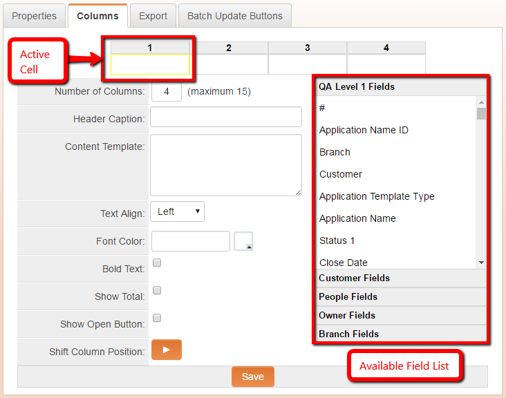
- The Columns tab is where the standard and custom fields that you want to be displayed in your list view are defined.
- When you first click on this tab, you will see the default four blank columns.
- When you click into a cell, you will see the configuration options below. Note that the Available Field List will display at the right. Standard fields are shown first, followed by the custom fields available.
- You can quickly click through the cells and use the Available Field List to choose the fields you wish to display.
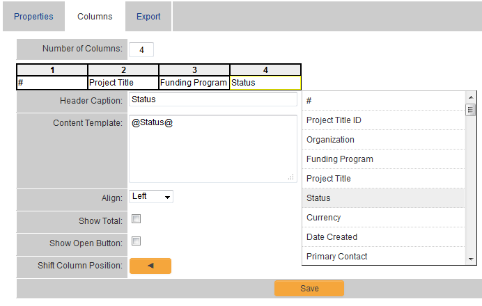
- When you select a field from the Available Field List, the Content Template will be populated with a SmartSimple variable that references that field.
- In the example below, the Status field has just been selected for Column 4.
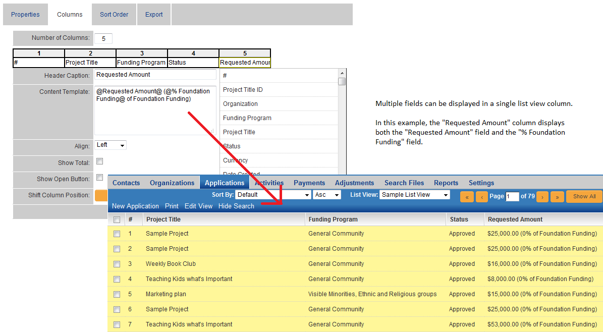
- Note that multiple fields can be selected for each column in the list view.
- First, click into an Active Cell and click on the fields you want to display in the column in the Available Field List.
- Then, add extra characters, such as parentheses and explanatory text as in the example below.
- HTML tags can also be employed, surrounding the variable(s) in the Content Template, to add formatting to the column values.
- An example would be entering @Requested Amount@ <b>(@% Foundation Funding@ of Foundation Funding)</b> into the Content Template, which would result in Requested Amount values in the list view displaying in the format: $25,000.00 (0% of Foundation Funding)
Note: Since the configuration of list views is performed by system administrators, any field can be selected to display in the list view. This means that if a field is selected for a given role's list view that has field permissions that deny visibility to that given role, that field will be visible to that role on that list view. The edit permissions set on the field permissions setting of custom fields will still hold sway, however.
Allowing users to click into the records from the list view
- What's missing from the "Sample List View" example above is a way for the user to access their records from the list view.
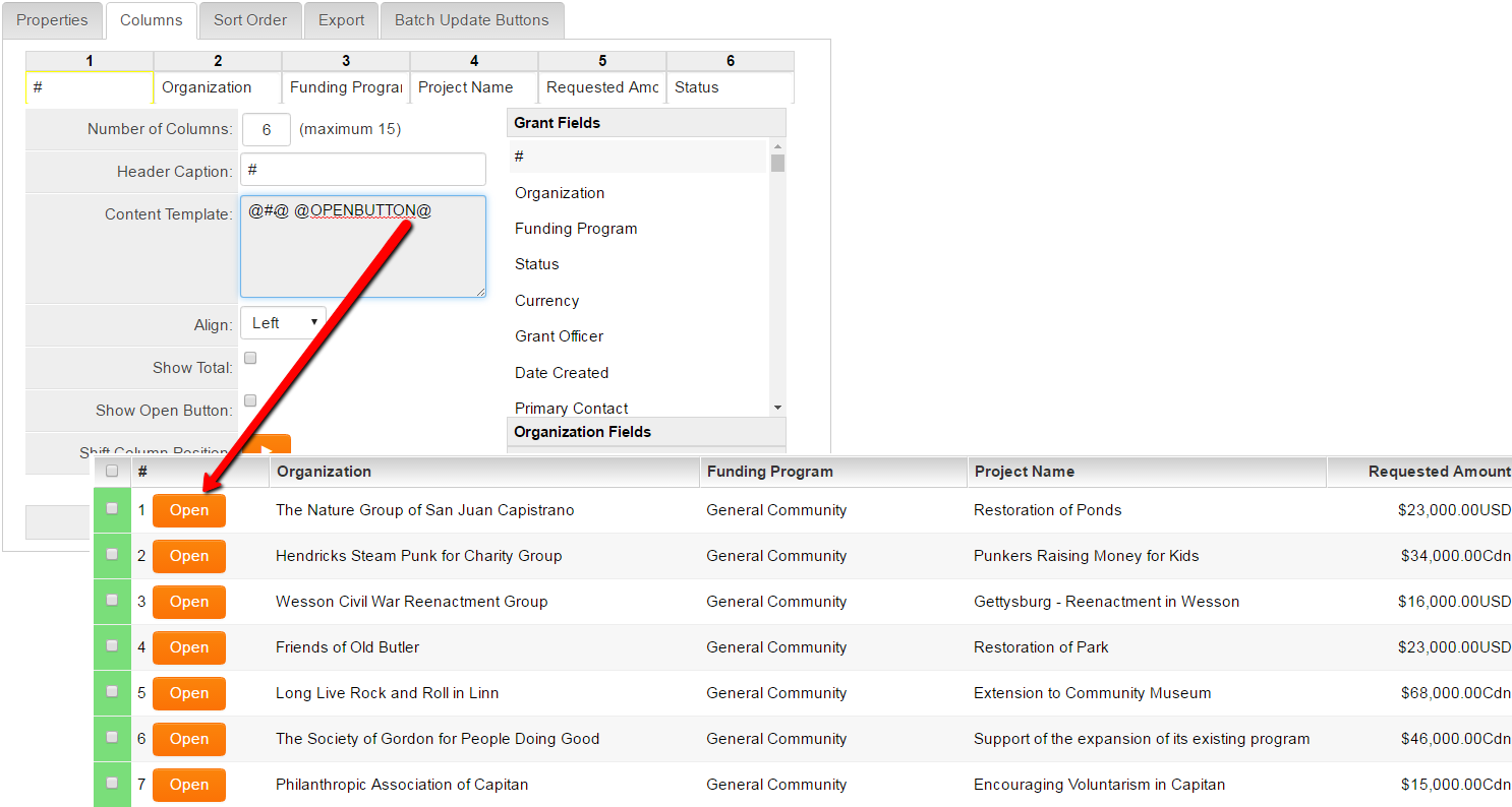
- The Open button can be added to any column in the list view, by selecting the "Show Open Button" option while clicked into a cell.
- Clicking on the "Show Open Button" option displays the @OPENBUTTON@ variable in the Content Template, which displays the button on the list view.
- As described above, the caption on the Open button can be changed on the "Properties" tab of the list view.
Definition of Options Available on the Columns Tab
- Number of Columns - This is the total number of columns visible in your list view. You can add or subtract the number of columns shown by editing this value and clicking out of the field.
- Header Caption - You can choose the name of the columns in your list view using the Header Caption option.
- Content Template - This will display the variable or variables you have selected using the Available Field List.
- Align - This will determine the alignment of the values in your list view column. The options available are "Left," "Right," and "Center."
- Show Total - If you have selected a single field containing numeric values, checking this option will display the total of the values currently displayed in your list view at the bottom of the list view.
- Show Open Button - Selecting this value will display the open button in the column selected, allowing users to click into the pertinent record from the list view.
- Shift Column Position - This will move the currently selected column to the left or right, relative to the other columns.
Sort Order and Export Tabs
Now that the list view has been created and the fields that should be presented have been defined, you will define the Sort Order and Export Settings (optional) for your list view.
Please visit the following pages:
See Also
- List View Overview
- Accessing the List View Configuration Page
- Configuring List Views
- Setting the Sort Order on a List View
- Exporting List View Results to Microsoft Excel
- Exporting List View Results to Microsoft Word
- Download files from List View
- Preparing Existing Word Template for List View Export
- Quick Edit
- Historic List View
- Configuring Interactive List View Charts
