Difference between revisions of "Colours & Fonts"
(→Left Navigation Settings) |
(→Navigation Settings) |
||
| Line 43: | Line 43: | ||
==Navigation Settings== | ==Navigation Settings== | ||
| − | These settings control the colours in the | + | These settings control the colours in the navigation [[Menu|menu]]. |
[[Image:Vis4.png]] | [[Image:Vis4.png]] | ||
Revision as of 12:48, 30 September 2016
Visual settings affect the entire copy of SmartSimple – all users will be affected by changes to the visual settings.
- Click the Colours and Fonts link.
The Visual Settings window is displayed.
Colours are displayed using the numeric value required by browsers; a sample of each colour is displayed to the right of the setting. The colour pallet icon is used to select alternate colours.
The Visual Settings are divided into a number of sections.
Contents
Global Settings
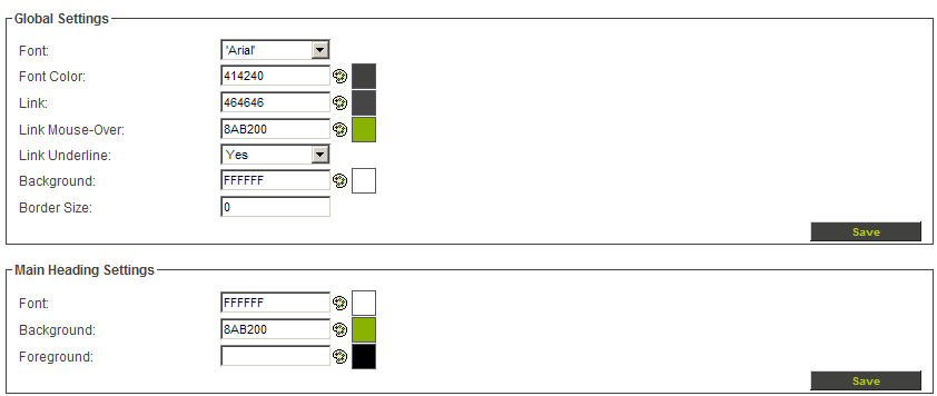
The global visual settings affect the overall interface.
- Font – the font used for all text displayed within SmartSimple.
- Font Colour – the default colour of the default font.
- Link – the colour of all links in the interface.
- Link mouse over – the colour to be displayed when the mouse is moved over a Link.
- Link Underline – determines if the link should be underlined.
- Background – default background colour of the application.
- Border Size – the width of the border within the application.
You can set the border size to 0 for a “flat’ look to your instance.
Main Heading Settings
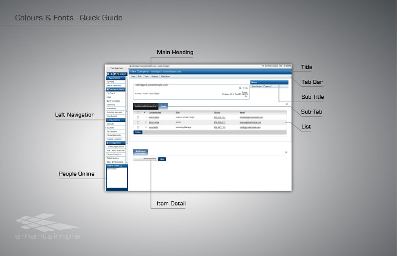
The main heading is the top line of SmartSimple.
- Font – font colour for the main heading.
- Background – colour for the top of the main heading.
- Foreground – colour for the bottom of the main heading.
If you set the foreground and background to different colours, a gradient fill will be displayed.
These settings control the colours in the navigation menu.
- Heading Font – colour of the font in the left navigation headings.
- Heading Background – colour for the top main headings in the left navigation.
- Heading Foreground – colour for the bottom main headings in the left navigation.
If you set the foreground and background to different colours a gradient fill will be displayed.
- Border Styles – you can also set the colour and border style and thickness for the top, bottom, left and right of the heading.
- Item Font – colour of the menu items.
- Item Background – background colour behind the items in the menu.
People Online Settings
These settings control the visual settings for chat and people online window.
- Title Font – font colour for the title in the chat and people online window.
- Title Background – background colour of the chat and people online windows.


