Custom Field Type: Lookup - Autocomplete Options
From SmartWiki
Contents
General Description
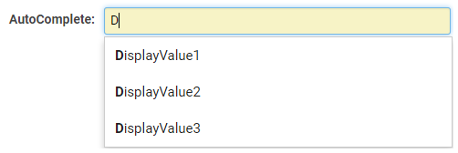
Displays as a set of values in an Ajax lookup box.
Field Illustrated

Setting the values for the Lookup - Autocomplete Options, in Custom Field Settings

Lookup - Autocomplete Options, in Edit Mode

Lookup - Autocomplete Options, in Edit Mode with Enable Multiple Select option selected - click on the grey 'x' to remove selection
![]()
Lookup - Autocomplete Options, in View Mode
Field Options
All common options:
General Settings
Permissions & Availability
Classic Options
For further information, please refer to Custom Fields – General Information.
Options listed below are specific to this particular field type.
| Predefined Options | The values you want to be listed within your dropdown list, delimited by semi-colons with no spaces. |
|---|---|
|
External Source Options
- Enable Lookup From External Source - once a source is selected (the only one available currently is Google Civic Information), you will be able to map external source values to custom Single or Multiple Line text box fields. Note: if there are multiple values in the search result, but you have mapped to a single-line text box custom field, only the first record will be returned.