Difference between revisions of "Date Fields"
From SmartWiki
Paul Dimerin (talk | contribs) |
Nancy Sabo (talk | contribs) |
||
| (10 intermediate revisions by 3 users not shown) | |||
| Line 1: | Line 1: | ||
| − | The '''Calendar | + | {{ DeprecatedPage }} |
| + | The '''Calendar Date Field''' allows for easy navigation and selection of dates within SmartSimple. The date picker features two drop down menus and a field in which to select specific days of the month. | ||
| − | + | : [[Image:Datepicker.png|link=]] | |
| + | The left drop down allows for selection of months: | ||
| − | :[[Image: | + | : [[Image:Month-datepicker.png|link=]] |
| − | : | + | The right drop down selects the year: |
| − | |||
| + | : [[Image:Year-datepicker.png|link=]] | ||
| + | The date picker is made available to a [[Custom Field Type: Text – Single Line|text field]] when "Date" is chosen as the field validation type. | ||
| − | + | [[Image:DateValidation.png|link=]] | |
| − | |||
| − | |||
| − | + | The date picker will pop up when a user clicks into a field formatted as "Date," or when the calendar icon next to the field is clicked. | |
| − | + | [[Image:FieldwithDateFormat2017.png|link=]] | |
| − | + | <!--[[Category:Glossary]][[Category:Custom Fields]]--> | |
| − | [[ | + | [[Category:Deprecated]] |
| − | |||
| − | |||
| − | |||
| − | |||
| − | |||
| − | |||
| − | [[Category: | ||
Latest revision as of 13:31, 10 September 2018
 This article is deprecated and the information contained within may no longer be correct. This article is deprecated and the information contained within may no longer be correct.
|
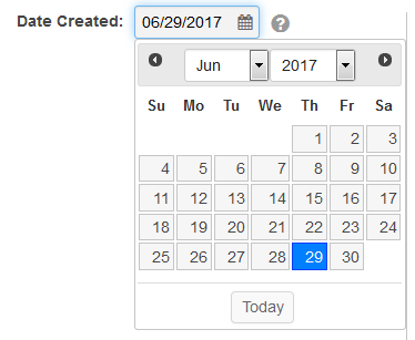
The Calendar Date Field allows for easy navigation and selection of dates within SmartSimple. The date picker features two drop down menus and a field in which to select specific days of the month.
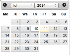
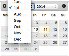
The left drop down allows for selection of months:
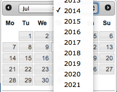
The right drop down selects the year:
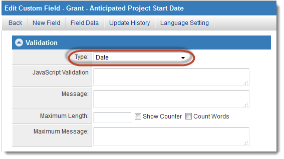
The date picker is made available to a text field when "Date" is chosen as the field validation type.
The date picker will pop up when a user clicks into a field formatted as "Date," or when the calendar icon next to the field is clicked.