Difference between revisions of "Custom Field Type: Select Many – Check Boxes"
Nancy Sabo (talk | contribs) |
|||
| (32 intermediate revisions by 9 users not shown) | |||
| Line 1: | Line 1: | ||
| − | + | ==General Description== | |
| + | Displays as a set of check boxes in '''Edit''' mode. The [[User|user]] can select multiple values. In '''View''' mode the values are displayed as text, semi-colon delimited. The # of columns option is used to define the number of columns required for display. | ||
| − | '''Edit Mode''' | + | ==Field Illustrated== |
| + | [[Image:Cf_smcb_ex1.png|link=]]<br /> | ||
| + | '' '''Select Many - Check Boxes''' field, in '''Edit Mode''' (above)'' | ||
| − | |||
| − | |||
| − | |||
| − | [[Image: | + | [[Image:Cf_smcb_ex3.png|link=]]<br /> |
| − | + | '' '''Select Many - Check Boxes''' field, in '''View Mode''' (above)'' | |
| − | < | ||
| − | |||
| − | |||
| − | |||
| − | + | [[Image:Cf_smcb_ex2.png|link=]]<br /> | |
| − | + | '' Setting the values for the '''Select Many - Check Boxes''' field, in '''General Settings''' (above)'' | |
| − | |||
| − | |||
| − | |||
| − | |||
| − | |||
| − | |||
| − | |||
| − | |||
| − | |||
| − | |||
| − | |||
| − | |||
| − | |||
| − | |||
| − | |||
| − | + | ==Field Options== | |
| − | + | All common options:<br /> | |
| − | + | [[Custom Fields - General Information #General_Settings|General Settings]]<br /> | |
| + | [[Custom Fields - General Information #Role Field Permissions and Status Field Permissions|Permissions & Availability]]<br /> | ||
| + | [[Custom Fields - General Information #Classic Options|Classic Options]]<br /> | ||
| + | For further information, please refer to [[Custom Fields – General Information]].<br /><br /> | ||
| + | Options listed below are specific to this particular field type. | ||
| + | {{ParentField}} | ||
| − | + | * '''Predefined Options''': The values to be used for each checkbox, delimited by a semicolon with no spaces. | |
| − | * ''' | + | {{SortValuesToDisplayVertically}} |
| + | * '''Enable as Attributes''' - | ||
| − | + | ==Notes== | |
| + | If you want the value(s) ''stored'' in the field to be different from what is ''displayed'' beside the check boxes you can use the following syntax in the '''Values''' section: | ||
| − | + | ''StoreValue1=DisplayValue1;StoreValue2=DisplayValue2;StoreValue3=DisplayValue3; | |
| − | |||
| − | |||
| − | |||
| − | |||
| − | |||
| − | |||
| − | + | The value '''before''' the equal sign will be stored. The value '''after''' the equal sign is what will be displayed by each check box, but does not get saved. | |
| − | + | * This technique is important when translating to other languages. The '''StoreValue''' must be the same in all languages. See [[Custom Field Language Settings|here]] for further information. | |
| − | [[ | + | |
| + | '''<u>Referencing the Value</u>''' | ||
| + | |||
| + | When trying to reference the values of this custom field type, you must use '''@fieldname.value@''' when the values in the combo box are 1=Yes;2=No;3=Maybe. | ||
| + | |||
| + | Using @fieldname.value@ will return the 1, 2, or 3. | ||
| + | |||
| + | {{RetiredOptions}} | ||
| + | |||
| + | ==See Also== | ||
| + | * [[Select Check Boxes by Default]] | ||
| + | * [[Allowing Only One Check Box to be Selected]] | ||
| + | * [[Custom Field Language Settings]] | ||
| + | |||
| + | |||
| + | {{CustomFieldPageFooter}} | ||
Latest revision as of 12:36, 23 November 2018
General Description
Displays as a set of check boxes in Edit mode. The user can select multiple values. In View mode the values are displayed as text, semi-colon delimited. The # of columns option is used to define the number of columns required for display.
Field Illustrated
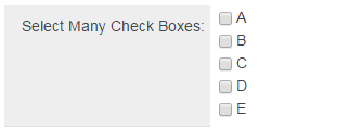
Select Many - Check Boxes field, in Edit Mode (above)
Select Many - Check Boxes field, in View Mode (above)
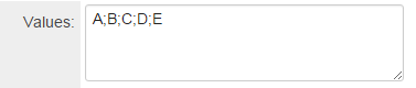
Setting the values for the Select Many - Check Boxes field, in General Settings (above)
Field Options
All common options:
General Settings
Permissions & Availability
Classic Options
For further information, please refer to Custom Fields – General Information.
Options listed below are specific to this particular field type.
- Parent Field - See Conditional Lists of Values page.
- Predefined Options: The values to be used for each checkbox, delimited by a semicolon with no spaces.
- Sort Options To Display Vertically: allows the user to display values of a checkbox field with multiple columns of values in columns.
The example below illustrates how values (designated "A" through "F") would be displayed if a checkbox field were to be configured with two columns:
| “Sort Options To Display Vertically” setting is Unchecked: |
“Sort Options To Display Vertically” setting is Checked: | |||||
| A B | A D | |||||
| C D | B E | |||||
| E F | C F |
- Enable as Attributes -
Notes
If you want the value(s) stored in the field to be different from what is displayed beside the check boxes you can use the following syntax in the Values section:
StoreValue1=DisplayValue1;StoreValue2=DisplayValue2;StoreValue3=DisplayValue3;
The value before the equal sign will be stored. The value after the equal sign is what will be displayed by each check box, but does not get saved.
- This technique is important when translating to other languages. The StoreValue must be the same in all languages. See here for further information.
Referencing the Value
When trying to reference the values of this custom field type, you must use @fieldname.value@ when the values in the combo box are 1=Yes;2=No;3=Maybe.
Using @fieldname.value@ will return the 1, 2, or 3.
Retired Options
If you need to hide options which are no longer being used but need to be retained for historical value, you can use the following syntax:
<ssRetiredOptions> </ssRetiredOptions>
Make sure there are semi-colons before and after the syntax.
Example: 1;2;3;<ssRetiredOptions>5;6</ssRetiredOptions>;7;8
When using this method, the retired options must not be the first options in the list. If the first option(s) in the list are to be retired, simply move them to the end of the list so that Option1;Option2;Option3 becomes Option2;Option3;<ssRetiredOptions>Option1</ssRetiredOptions>;