Date Fields
Revision as of 12:31, 10 September 2018 by Nancy Sabo (talk | contribs)
Revision as of 12:31, 10 September 2018 by Nancy Sabo (talk | contribs)
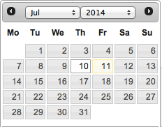
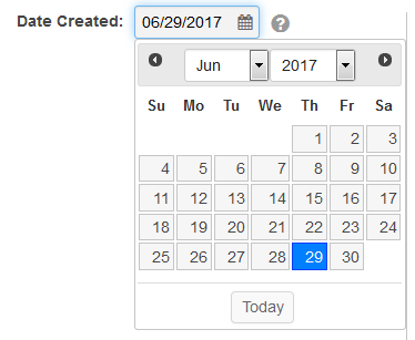
The Calendar Date Field allows for easy navigation and selection of dates within SmartSimple. The date picker features two drop down menus and a field in which to select specific days of the month.
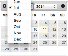
The left drop down allows for selection of months:
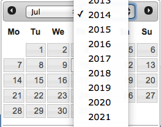
The right drop down selects the year:
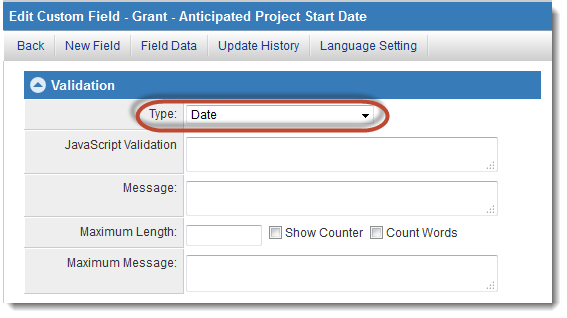
The date picker is made available to a text field when "Date" is chosen as the field validation type.
The date picker will pop up when a user clicks into a field formatted as "Date," or when the calendar icon next to the field is clicked.
