Portals
Contents
Overview
A Portal is the SmartSimple terminology for the graphical user interface that a user will see upon login. The Portal interface will change for each user dependent on their role and what you, as Global Administrator, have configured for that role. This article will give you an overview of how to easily configure your portals for your users with the portal builder. We will explore what options are available when creating a portal, and provide guidance on how best to utilize these options.
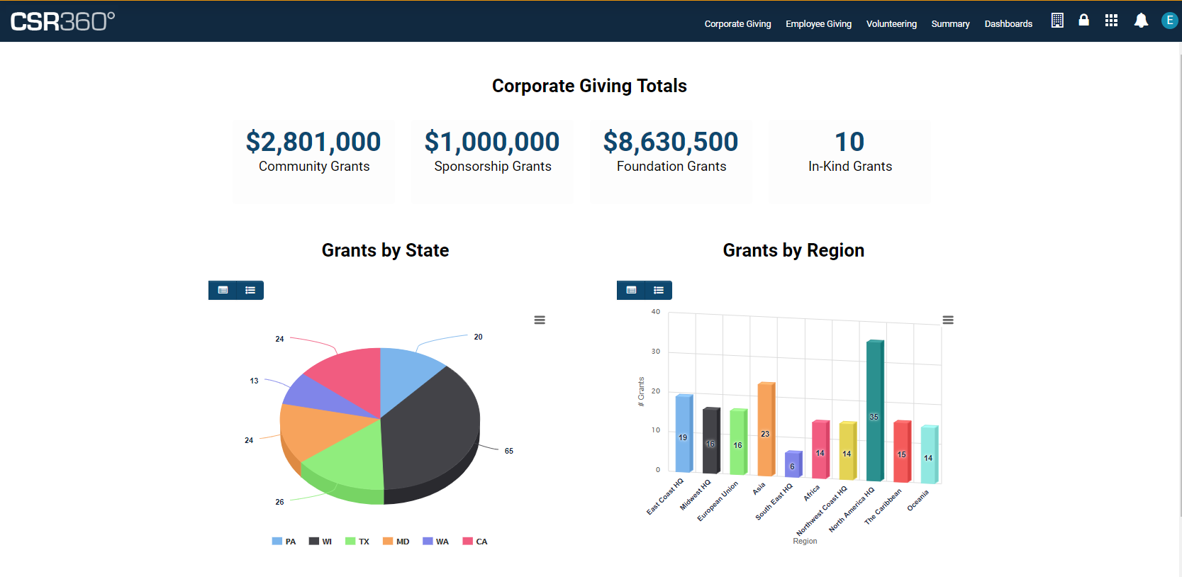
Example of a Portal
Once a user has been activated, they will be able to log into your SmartSimple instance.
All the elements of a user's portal - such as the Main Menu links are displayed on the top header, what graphics or texts are displayed on each page, the user's personal menu items and more - are all highly configurable.
Portal Building – Essentials
User Roles
User roles organize or group like users together, and in conjunction with permissions and other logic, control what people can see and do in SmartSimple. User Roles group like people together and are additive, meaning that a user may possess multiple roles, so roles need not be mutually exclusive. Typically, we group users on what they will be doing. Example: applicants, reviewers, and approvers, and by department: accounting, sales, partners. Before you can build a portal, you need to define user roles in your system. You can define new user roles by going to the menu icon > Roles and Security > User Roles. Please note we take a most restrictive approach when it comes to permissions, so if you set one role to deny something, it will supersede all other permissions. This means if a user has 3 roles, and 2 roles have permission to do something but the third role does not, the user will not be able to do that action. So as a general practice it is better to add permission then to deny permission on a role. This way, the more roles you have, the more you can see and do in the system.
The Plan
Before you start building a portal, plan out what each user will need to see and do in their portal. Let’s use a grant applicant as an example. The grant applicant will likely need to be able to:
- See what funding programs are available and apply to those.
- See the status of their applications in progress and modify them.
- Update their profile and maybe their organization's profile.
- See a list of items that require their immediate attention, such as submitting a report or revising an application.
We can use the above to generate simple use cases for our sample grant applicant portal. Now that we have User Roles and we know what our users are going to do in the system, we can decide where we are going to create the portal.
Common Aggregated Portal vs Single Role Portals
There are two ways in which you can create a portal. You can create the portal on the Common role which is aggregated, meaning assets are shared across multiple roles, or you can create a portal on a single role. If you take this path, assets will not be shared and users will need to flip between roles.
Common Aggregated Portal
Creating a portal on the common aggregate role is recommended. This role is not the same as all other roles, as you did not need to create it. The common role is a construct that automatically appears in all SmartSimple system. Anything you add to the common role can be permissioned to be seen by all or some of the roles you have created in your system. To use this option, build your portal on the common role. When you create an asset such as a section inside the common role portal, you can permission that asset to be viewable by specific roles. This way you can build an asset like a help link and share it amongst all user roles. If you need to change the help link, you change it in one place and all users will see that change. If a user has multiple roles, they will be able to see and do whatever all their roles have permission to do. Lastly, creating assets on the common role means users do not need to switch between portals using a drop down in the header, as they can always see whatever they have permission to see and do.
Single Role Portal
This portal configuration is generally not recommended. With this option, you create a portal on each role. So, the applicant portal is built on the applicant role and the reviewer portal is built on the reviewer role. The drawback to this approach is that if you need to create a help link, you need to build it on each role. If you want to change the link you must go into each role to change it. If users have multiple roles, there is a drop down in the header that allows the user to switch between applicant and reviewer portals, but you only see one portal at a time and don’t have access to all the functionality that has been permissioned for you at one time. Although it is easy to understand and configure one portal per role, it is generally harder to maintain and provides a worse user experience, given people may have multiple roles (example I am an employee and grant manager).
Structure of the Portal
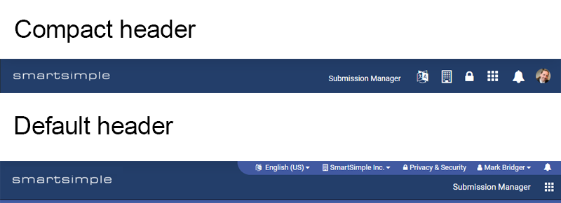
The portal header consists of 3 elements: the Logo, the user menu and the main menu. There are also two styles of header, the default and the compact.
Logo
By default, your system logo will appear in the top left of the header. This logo should be 112 pixels high by approximately 250 pixels wide in PNG format. The width of the logo can vary but the height is constant. Transparent background is recommended for your logo in case you want to have a colored background on your header. Optionally, you can choose to display an alternate logo by uploading a different logo into a SmartFolder and then choose the SmartFolder option. You can also specify a different logo from a SmartFolder for each language you support. So, users who speak Spanish can see a different logo than users who speak English.
User Menu
If you are using the compact header (recommended) the user menu appears on the far right and will display your initials, name or photo. The user menu is intended to hold links that pertain to the user, such as updating the user’s profile, the user’s organization, and possibly switching the user’s language. If you create a link here, try to keep the caption to a word or two, like “Edit Profile” or “My Profile”.
| Link Type | Description |
|---|---|
| Organization Profile |
This link type takes the user to their organization profile. By default, if you have permission to edit the profile you will be taken directly into edit mode. You can toggle off this setting if you want to bring everyone to the profile in view mode. |
| Custom | This link type can take the user to any page within your system, for example, to go to the dashboards, enter “/iface/dashboard.jsp”. Note, always use relative URLs to ensure links work across servers and to ensure your system functions as expected. |
| Drop Down | Not recommended. This legacy setting was used with the default header and it enabled you to add a drop-down menu in the user menu. |
| Language | Use this link type to surface a language drop down on your portal. The user will be able to switch their portal into any language you have enabled. Note, if you choose to support multiple languages, you must also enter translations for your content into the system. For example, you will need to specify the translation for every menu link and section you have added to your portal. You can do this via a language drop down where you configured those assets. In other areas of the system, such as on custom field configuration pages, you will also need to provide a translation for every caption. |
| Change Password | This link type takes the user to the change password screen. |
| SmartFolder | This link type is used to surface a SmartFolder in your portal. For example, if you had resources in a SmartFolder such as help documentation, you could add this link to your user menu and the user could go direct to that SmartFolder and open it in the current window, a modal window or a new window. |
| User Profile | This link type takes the user to their personal profile. By default, if you have permission to edit the profile you will be taken directly into edit mode. You can toggle off this setting if you want to bring everyone to their profile in view mode. |
Main Menu
If you are using the compact header (recommended), the main menu will appear in line with the user menu. You can have three types of content in the main menu. A single page, sections, and subtabs, which are a drop-down menu of links. Essentially you will have a combination of links and drop-down links. Each link will take the user to a location. The main menu is intended to hold links to UTAs or other specific areas of the system. Note: keep in mind the only links that should be in the main menu are the most important links that need to be present all the time. If something does not need to be always visible you may want to make it a shortcut instead. If you do create main menu links, keep the amount of links around 5 or less for usability. More links increase cognitive strain on users so always try to keep portals simple. Also, try to keep the captions of these links to 1 or 2 words.
Header Style Compact
The compact header style displays everything in a single line. It features consistent interactions, takes up less vertical real estate and looks more modern. We suggest you turn on this system-wide setting, but be aware it will affect all users for all roles. To enable the compact header, go to menu icon > global settings > branding > toggle on Enable Compact header.
Header Style Default
By default, your header will have a user menu and main menu that are separated. Some users find this confusing and cluttered so you may want to avoid this style of header.
The Body of the Portal
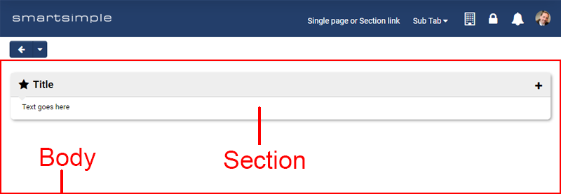
Inside the body of the portal, a page will be displayed. The user clicks a link in the main menu or user menu to change which page is displayed in the body of the portal. The user can also navigate to other pages from inside the page. Inside that page, you will likely have sections. Think of each section as a box or container. Inside each section, you will add content such as a list view, chart, text or shortcuts.
Choosing a layout
If your main menu or user menu link does not take you to an existing page in the system, then you can create a page by selecting the content type called sections. You can add a section with the plus button or use the “Add layout” button to create a layout which is an arrangement of sections. We recommend creating sections in single column as they will render best on all screen sizes and this provides a better experience for people using assistive technology.
Creating a Page
To create a page for your portal, navigate to Global Settings > Users tab > Portals and edit the desired portal. Under the Portal Page title bar, click the plus button to add a portal page.
Creating a Section
You can create a section by clicking the add section button. Inside the section there are differing options based on the type you select. Not all options are available for all types. Typically, you will see the following:
General tab
| Setting | Description |
|---|---|
| Name | used for reference not displayed to end user |
| Title | will display in the section |
| Icon | will display beside the title |
| Description | used for reference not displayed to end user |
| Instruction | used for adding text under the title |
Display tab
| Setting | Description |
|---|---|
| Width | Used to control the width of a section. Generally, avoid using this setting as single column is preferred for usability and accessibility reasons. Keep in mind if you set a width it may look good on your screen but it will look poor for users with different screen sizes. We recommend you leave this setting empty so the section will render full screen. If you must add a width then use percentage so it will scale. |
| Height | Used to control the height of a section. Generally, avoid using this setting as well. Different users will have different screen resolutions so what looks good for you won’t necessarily look good for them. By default, the height of a section will be large enough to hold whatever content is inside. If you use this setting your content may cut off and you may get a scroll bar inside your section. If you must use this setting then enter a pixel value but generally leave it empty. |
| Shadow | Turn off the shadow |
| Margin | Turn off the margin |
| Background color | Control the background color of the section. |
Permission Tab
If you are creating a section on the common role (recommended) you will see the permission tab. On this tab you specify which roles will see this section.
Section Order
The order in which menu items appear is from left to right. You can reorder the sections by clicking the enable reorder button. Then, drag and drop rows to order your items as you desire.
Moving a Section
After you have created a section you can move it to another location within your portal by using the move button in the submit bar.
Choosing a Section Theme
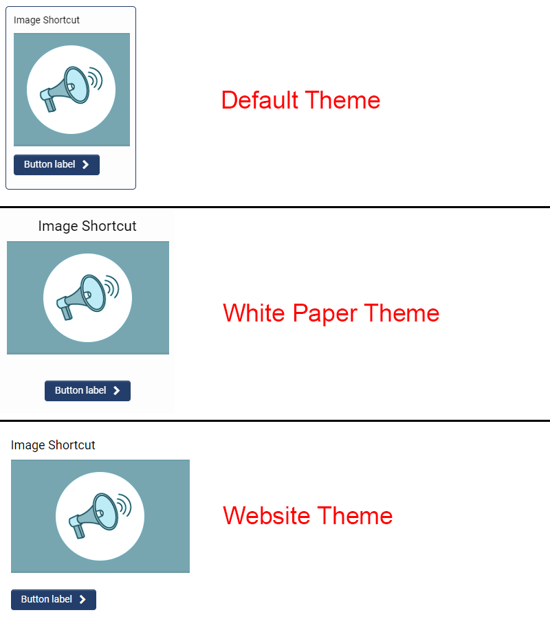
Beyond choosing the layout, you can choose how you want your sections to look. There are three theme options: Default, White paper, and website. You can mix and match these themes at the page level. So, you could have a home page that uses the website theme and then another page for applications in progress that uses the white paper theme. It's easy to flip between themes and see which will work best for you. To change the theme for a section:
- Go to the Main Menu or User Menu link with the content type set to Sections.
- Choose the desired theme from the drop-down.
- Click Save.
- Go to the root of the portal using the hierarchical navigation.
- Click the Preview button.
You can try out different themes for each page this way. Note: the functionality and configuration options differ for each theme. For example, in the default theme you can render a section in split screen whereas that is not available in the white paper or website themes.
Default theme
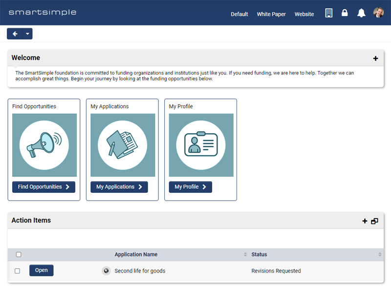
The default theme has boxes around each section. This theme enables you to fit more content inside a smaller area. Typically, this theme is used for people who are managing many tasks and who need to see a lot of information.
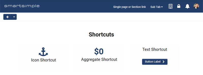
Note: in the shortcut section I have toggled off margin and shadow for the shortcut section. This setting is found on the display tab of that section.
White Paper Theme
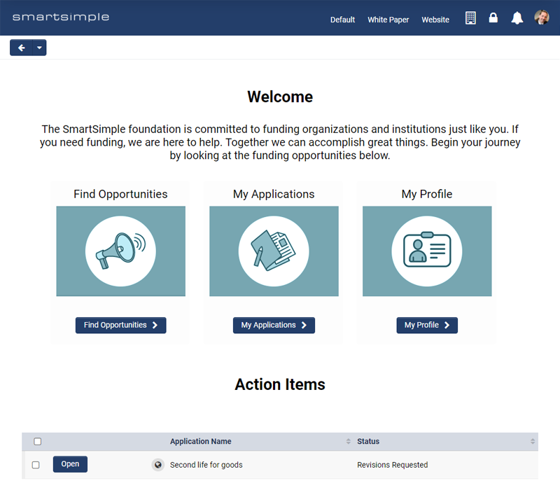
The White paper theme has no boxes. Everything is clean and white with extra padding, content is bigger for better visibility and text is aligned center. Typically, this theme is used for people who are doing a few simple tasks or by those who like a more modern look.
Website Theme
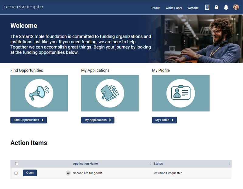
The website theme was designed with imagery in mind. This theme looks more like a website with graphical banners and image shortcuts. Typically, this theme is used for people like applicants or volunteers, and when you want to convey a brand feeling or tone.
learn how to create a website themed portal page
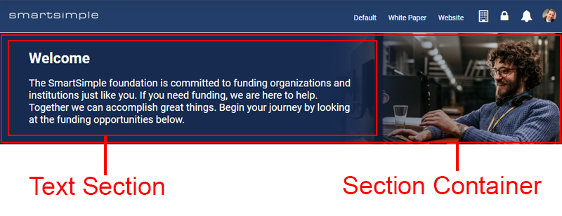
Note: to create the top banner, I used a section container and uploaded a background image and set the background opacity to Low and changed the font color to white. These controls are found on the display tab of this section. Inside the sub section I created a text template and set its width to 65% so the text does not cover the image at most resolutions.
Portal Page Section Types
Once you have created a main menu link and set it to sections, you have a number of section options. Below is an overview of each section option.
Chart
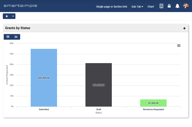
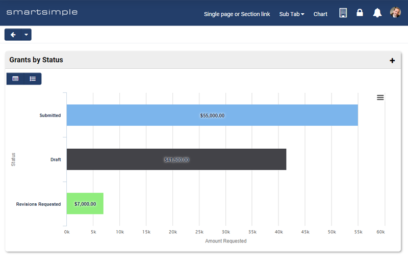
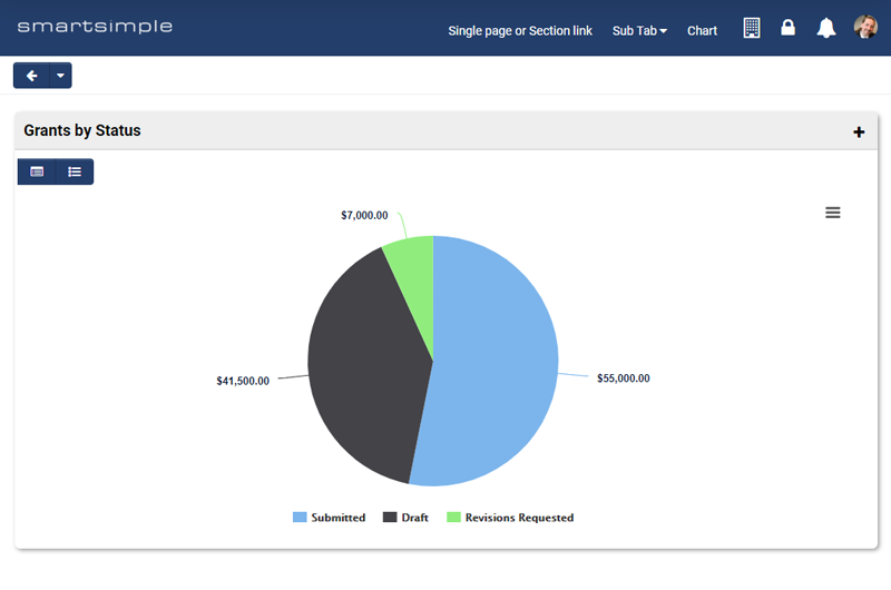
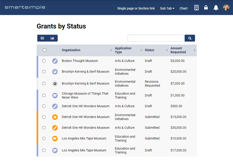
Create interactive charts directly from a list view with this section type. This section type gives you the ability to see charts and data tables and it enables the user to drill down into the data for a more granular view. For example, you could see grants aggregated by status and then flip the chart into table view to go directly to a specific grant. The user can also download charts in PNG, JPG, PDF, and SVG format.
To set up a chart section:
- Create a list view with the information you want to chart. If you are only going to use this list view with charts, check configuration only on the list view and it will not show up in the regular list view drop down to users.
- In the desired section, choose the type called “Chart”.
- Choose the desired list view and/or filter.
- If you want the user to be able to switch between the chart and the underlying table, enable view options. If you have enabled view options, you can also enable the search panel when in the table view.
- Pick the chart type; for example pie or bar.
- Pick the fields you want to map to the X and Y axis and enter desired captions.
- Choose the aggregation type; for example sum or count.
- Save
Custom Link
The custom link enables you to create a link to any area within the system. Use the lookup button to choose an area in the system you want to link to and it will populate the URL field. You can also manually enter a URL to other areas of the system, but if you do so make sure you use a relative path. For security reasons, we don’t allow linking to pages outside your system.
List View
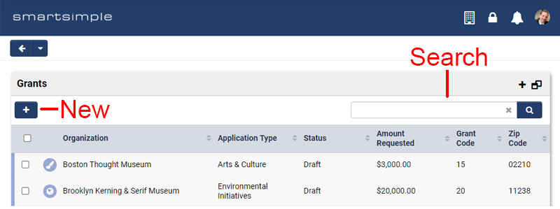
The list view section type enables you to surface a list view from another area of the system. For example, show a list of applications in progress or a list of open calls to which the applicant can apply from a UTA. You could also show a list or organizations or users. To setup, select the desired list view and optionally select the desired filter and save.
Show New Button: this option enables the user to create a new record from your list view. For example, if I am looking at a list of level 1 applications, you can allow the user to create a new level 1 application from this section.
Show Search Panel: this option allows you to surface search functionality on your list view within the portal.
List View - Mixed Record Type
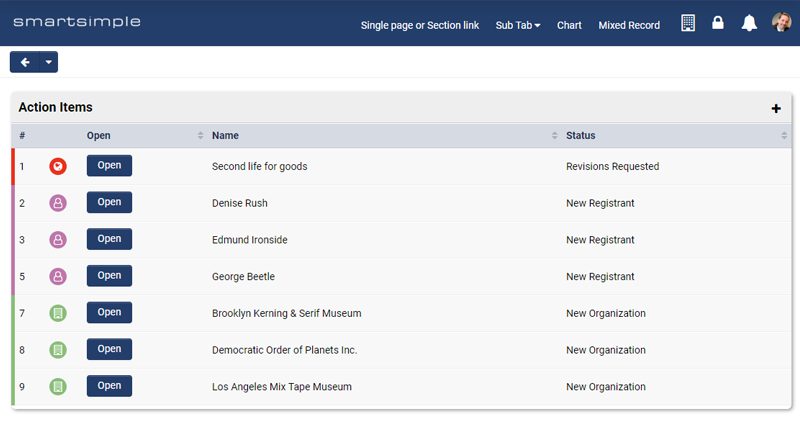
The list view mixed record section type enables you to create a list view composed of different record types. Generally used to create a single task list of all your to-dos, without the clutter and effort of creating each individual list as its own section in your portal. To setup:
- Select a list view and click the + button.
- Repeat for each list view you want in your mixed record type section (example UTA, User, Organization) note: list views must have a filter.
- Select the number of columns desired (if you have enabled default buttons they will appear in the first column) .
- Give your columns a caption for each header.
- Choose a column to sort by.
- Click Save.
Note: the intent of this section type is to display a list of records from multiple areas and give users an easy way to go to a record so they can edit it. You are also expected to make sure the list views you choose have the same number of columns with the same type of information in the same columns. For example, if I combine 3 list views the first column in all of them should hold something like the name or title of the object.
Row Clickable: this option enables the user to be able to open the record by clicking anywhere on the row. If this option is toggled on you do not have to surface an open button on the row.
Show Search Panel: this option surfaces a search input so the user can refine what appears in their list view.
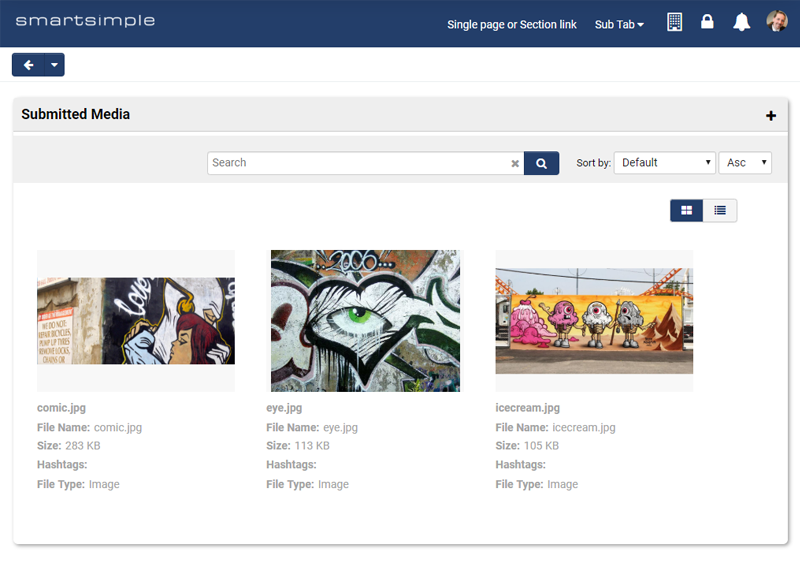
Media Files
The media files section type enables you to surface media uploaded to applications inside a portal section. For example, you could display all the artwork submitted as part of the application process for applications that were approved.
Optionally, you can filter media that is displayed by media type (video, audio, images) and by status of the record and type of the record.
Section Container
The section container type is different than the other section types as it is used to control the layout of sections. Typically, the section container is used to hold another section. For example, in the website theme, you might use a section container to display a background image across the full width of the page. Then you might place a text section inside this container and restrict its width to 70% of the page. This would give you a banner with an image background and text overlaying that image, but the text would be constrained, so the user could see more of the background image.
Section in Tabs
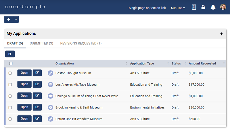
This section type is used to display multiple sections within a single section. For example, you could have a section called applications and then within that section, you could have a number of tabs such as Applications in progress, applications in review and applications funded. The user can click on any tab to see the corresponding list view. Optionally you can choose to show the record count for each tab as well as choose to have a new button and a search panel.
Shortcuts
If you have configured shortcuts on the shortcuts tab of the common (or your desired) role, this section type enables you to surface those shortcuts in a section. Shortcuts come in 4 styles (Icon, aggregate, Image and text) and they generally link to an area of the system such as a list view.
You can select which shortcuts you want to appear in which section via a lookup. This way you can have multiple shortcut sections with differing shortcuts in each. If you do not select any shortcuts, all shortcuts you have permission to see will display.
We recommend only putting one style of shortcut in each section, example have a section of only image shortcuts or only icon shortcuts. Mixing and matching of shortcut styles should generally be avoided.
Text Template
The text template section is used to display text-based information such as a notice, instructions or a welcome message.
Portal Building – Advanced
Previewing a portal
While building a portal you can preview your work from inside the portal builder. To do so:
- Click on the root of the portal in the hierarchical navigation
- Scroll down and click the preview button
- If you are in the common role (recommended) you can choose with which user roles you want to preview the portal.
- Click the refresh button to see the portal using the roles you checked.
Testing a portal
Although preview is a good and quick way to see how your changes are affecting your portal, you still need to test with an actual user. Always setup an actual test user the same way you will set up real users and test the portal using that user as well. When testing you may want to use the Chrome browser with incognito mode to ensure you don’t get any session bleed from your administrator account. If anything seems to behave in an unexpected way, close your browser, and clear your browser cache and then try again. You can clear your browser cache by CTRL + SHFT + Delete.
Making changes to a live system
Whenever you make a change in the portal builder, it is instantly pushed live to all the users of your system. If your system is already live, you are going to want to configure and test without pushing those changes live. To do this, enable draft mode. In draft mode, you can make a copy of your existing portal, change it as you see fit, test it and then promote the draft version to live when you are ready.
To enable draft mode and deploy to live:
- Go to Menu icon > Roles and Security > user Roles > and edit the desired role (preferable the common role)
- If you do not see draft portal in the left navigation, click the Arcadia Portal Draft Mode button in the action bar
- Click refresh button; this replaces anything in your draft portal with a copy of whatever is currently configured in the live portal
- Save and make any changes you desire.
- Preview like you normally do. When you are ready to make the draft portal live, click deploy in the submit bar.
- The draft portal is now active and the active portal is now draft
