Difference between revisions of "Portal design"
(→Creating Shortcuts) |
(→Creating Shortcuts) |
||
| Line 127: | Line 127: | ||
* '''Re-Order''' – re-order shortcuts. | * '''Re-Order''' – re-order shortcuts. | ||
| − | 7. If you wish to edit an existing shortcut, click on the name and | + | 7. If you wish to edit an existing shortcut, click on the name. It will be highlighted on the left side and the settings will be displayed in the panel on the right. |
8. The following controls are displayed in the panel on the right. | 8. The following controls are displayed in the panel on the right. | ||
Revision as of 10:05, 12 October 2017
When a user logs into the system, their view of the system is defined by the portals associated with their role(s) and how the menu option is configured.
The Portal Design mechanism provides for an icon-based SmartSimple interface specific to a role.
It provides a mechanism to simplify the system interface for specific groups of users.
Contents
Portal Options
SmartSimple provides 3 main portal interface options.
- Classic
- Contemporary
- Arcadia
These are discussed below.
Classic Portal Design
The following is an example of a Classic Portal Design:
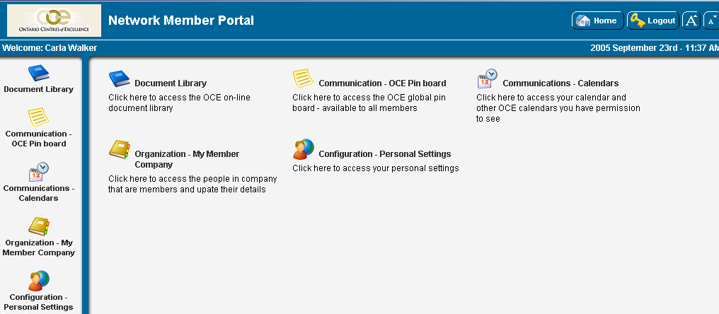
The setting for configuring a Classic Portal Design are discussed below:
- Priority – defines the priority of this portal, if the user has more than one portal role - 0 being the highest priority.
- Style - toggles between Classic and Contemporary portal design.
- Portal Title - overall title for the portal
- Width - determines the overall width of the portal.
- Left Menu Icon Text – displays the name of the icon in the left panel.
- Side Bar Width – the width in pixels of the left panel.
- Side Bar Icons – the icon size for the left panel. Choose from small, medium and large.
- Dividing Bar Width – the width in pixels of the dividing line, between the left panel and the main panel.
- Header Height - the height in pixels of the header section of the portal.
- Footer Height - the height in pixels of the footer section of the portal.
- Orientation - Choose between "Align Left," "Align Centre" and "Align Right."
- Shortcut Variables - provides the ability to add shortcut variables to custom portals using HTML formatting.
- Template: Header – HTML content of the top panel.
- Template: Left Menu – HMTL content of the left panel.
- Template: Body Introduction - This section allows portal designers to add instructions, report statistics and System Variables above the user's portal on the home page.
- Template: Body – HTML content of the body of the portal.
- Template: Footer - HTML content of the bottom panel.
Contemporary Portal Design
The following is an example of a Contemporary Portal Design:
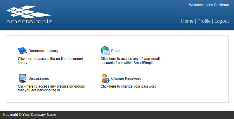
The setting for configuring a Contemporary Portal Design are discussed below:
- Priority – defines the priority of this portal, if the user has more than one portal role - 0 being the highest priority.
- Style - toggles between Classic and Contemporary portal design.
- Width - determines the overall width of the portal.
- Portal Title - overall title for the portal
- Template: Header – HTML content of the top panel.
- Template: Body Introduction - This section allows portal designers to add instructions, report statistics and System Variables above the user's portal on the home page.
- Template: Body – HTML content of the body of the portal. Can include report statistics and System Variables. If content is entered into the Body, it will replace all of the Body, including the Body Introduction.
- Template: Footer - HTML content of the bottom panel. Can include report statistics and System Variables.
Arcadia Portal Design
The following is an example of an Arcadia Portal Design:
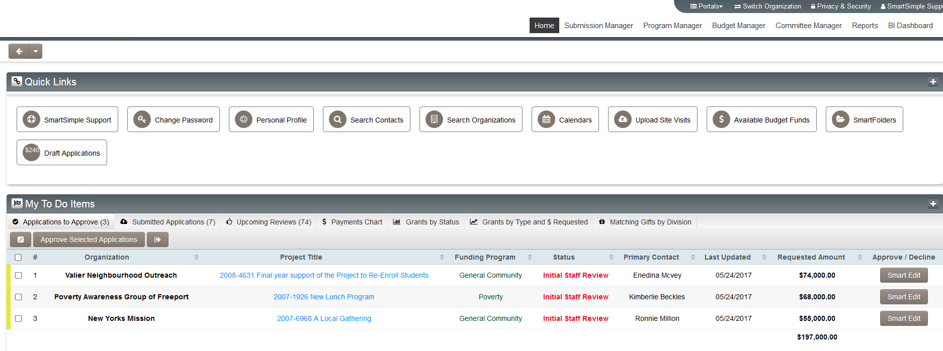
The setting for configuring a Contemporary Portal Design are discussed below:
- Priority – defines the priority of this portal, if the user has more than one portal role - 0 being the highest priority.
- Style - toggles between Classic and Contemporary portal design.
- Icon Size - size of any shrtcut icons displayed on portal
Configuring Portals
Modifying the Portal
You can make modifications to the portal view through the use of the Portal Design feature.
1. While logged in as a system administrator, click on the Roles and Security Settings link.
2. Click on the hyperlink for "User Roles."
3. Click on the Edit option for the "User Roles" you wish to configure the portal against.
4. Click the "Portal" tab. The Portal window is displayed.
5. Select from the three styles of portal designs available:
- Arcadia X
- Classic
- Contemporary
6. Configure Menu options as required.
7. Click Save.
For Classic and Contemporary Portals you will need to configure Shortcuts.
For Arcadia Interface you can also configure Shortcuts, but you also will need to go to the Arcadia tab.
Shortcuts
If the Portal design is either Classic or Contemporary then the selected shortcuts are displayed in the main panel of the window and also displayed as icons in the left navigation pane.
If the Portal design is Arcadia X then the selected shortcuts will be dependent on the configuration of the Action tabs.
Creating Shortcuts
1. Click the Configuration, Roles and Security Settings link.
2. Click on the hyperlink for "User Roles."
3. Click on the Edit option for the relevant role or New Role if creating a new user role.
4. Click the "Shortcut" tab.
5. New Shortcuts are added using the right panel of the window, and are listed on the left side of the window once created.
6. The following tabs are displayed at the top of the left hand panel:
- New Shortcut – clears the shortcut displayed in the top of the window, and starts a new shortcut.
- Import – imports the shortcuts from a portal you have previously created.
- Export – exports the shortcuts so you can create another portal for a different role.
- Re-Order – re-order shortcuts.
7. If you wish to edit an existing shortcut, click on the name. It will be highlighted on the left side and the settings will be displayed in the panel on the right.
8. The following controls are displayed in the panel on the right.
- Name – the name you want to display to the right of the shortcut icon.
- Description – the description you want to display below the shortcut icon.
- Category – the category that the shortcut should be grouped under.
- Order – the display order of the icons in the portal. Icons are displayed left to right and top to bottom.
- Style - either Icon or Aggregate
- The Icon option is the traditional icon based shortcut associated with the Classic and Contemporary portal designs. The following settings are associated with this style:
- Icon Type – the type of icons you wish to use. Click on the Show button to choose the icon from a selection page.
- Icon – the specific icon taken from the icon type.
- URL – the link to the item. See also Determining the URL of a report.
- Visibility Condition. - allows you to use conditional logic to determine whether or not this icon is visible
- See Visibility Condition for examples
- The Aggregate option is designed for the Arcadia X interface and will only work properly if the Use Classic Shortcut Panel setting is switch off.
- It allows configuration of a shortcut to a list view. The shortcut would display an aggregate calculated from the list view (eg. sum, count, avg) and can link to access the actual list view. The following settings are associated with this style:
- System List View – select List View that will be used for Aggregate section.
- Aggregation Column – select column in List View that will be used in calculating aggregate
- Aggregation Type – Sum, Count or Average
- Number Format – Comma, Currency, Abbreviation, None
- Precision – select precision option
- Link to list view – Aggregate will link to list view if clicked
- URL – Aggregate will link to URL if clicked
- Visibility Condition – allows you to use conditional logic to determine whether or not this icon is visible
9. Click either of the two buttons displayed in the bottom of the right hand panel:
- Save – save the shortcut settings.
- Clear – clear the current shortcut settings from the right hand panel.
Make sure you click the Clear button or New Shortcut tab when adding shortcuts; otherwise you may overwrite the same shortcut on the list.
Arcadia
There is a standalone article covering configuration of Role Based Arcadia portals.
Appendix
Comparison between Menu and Portal Interfaces
The following table outlines the key differences between the two interfaces.
| Feature | Administration | Portal |
| Navigation | Left Panel contains menu items | Icons displayed in main panel and also optionally displayed in the left panel. Left panel icons can be suppressed. |
| Interface Title | Not applicable | Portal Title associated with the role is displayed next to the uploaded company image. |
| Home Button | Left navigation below uploaded company image | Top right of the window. Home button takes user back to Portal icons. |
| Logout button | Left navigation below uploaded company image | Top right of the window |
| Personal Settings Link | Above uploaded company image | Below uploaded company image |