Difference between revisions of "Custom Field Type: Text Box– Text Single Line"
From SmartWiki
| Line 34: | Line 34: | ||
<u>'''Field Validation'''</u> | <u>'''Field Validation'''</u> | ||
| − | * '''Type''': Date, Numeric, Alphabetic | + | * '''Type''': Select Date, Numeric, or Alphabetic validation |
| − | * '''JavaScript Validation''': | + | * '''JavaScript Validation''': Here can be entered any specific JavaScript validation for this field |
| − | * '''Message''': | + | * '''[[Validation Message|Message]]''': Message the user will see if entry fails validation check |
| − | * ''' | + | * '''Maximum Length''': Sets the maximum length of the text entry. <b>Show Counter</b> determines whether a counter will be shown to the user. <b>Count Words</b> sets the counter to count words (instead of characters, the default). |
| + | * '''Maximum Message''': Message the user will see when they reach the maximum length | ||
To turn a text box into a '''read only''' box, you can use '''HTML'''. Insert the following (readonly class=textreadonly) into the HTML tag:<br> | To turn a text box into a '''read only''' box, you can use '''HTML'''. Insert the following (readonly class=textreadonly) into the HTML tag:<br> | ||
Revision as of 16:35, 4 May 2009
General Description
A single line of text.
Field Options
- Display Order: The order (relative to other fields) in which this field is displayed
- Tab Name: Displays the field under a given tab
- Field Name: The name of the field, used internally to reference the user's input
- Caption: The leading question or prologue before the field
- Allow Empty: This checkbox allows the field to be left empty
- Searchable: This field can be searched within the tracking application
- Track Changes: Keeps track of changes made to this field
Special Options for Field
- Default Text: The default text that will be displayed in the text box
You can refer to variables as part of the Default Text as explained in this article
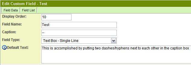
You can also hide the caption on the field so that only the text entry box appears:
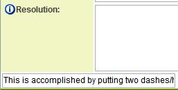
The result of the custom field will be:
Services
- Enable Map Service: displays the map icon next to the field name that will launch the user’s selected map service and display a map of the content of the field
- Enable People Search Service: displays the search Internet icon next to the field name that will launch a variety of search services and display the contact details from those services
- Enable Organization Search Service: displays the search Internet icon next to the field name that will launch a variety of search services and display the organisations details from those services
Field Validation
- Type: Select Date, Numeric, or Alphabetic validation
- JavaScript Validation: Here can be entered any specific JavaScript validation for this field
- Message: Message the user will see if entry fails validation check
- Maximum Length: Sets the maximum length of the text entry. Show Counter determines whether a counter will be shown to the user. Count Words sets the counter to count words (instead of characters, the default).
- Maximum Message: Message the user will see when they reach the maximum length
To turn a text box into a read only box, you can use HTML. Insert the following (readonly class=textreadonly) into the HTML tag:

Value Stores To
- Custom Field: Enables linking two different custom fields to the same user data
Field Formatting Options
- Width: Determines the width of the field, in characters
- Style: Bold, Underline, Italic, Highlight
- Tool Tip: Enter help text to be shown on mouse-over
- Read Only: Checkbox
- HTML Tag: Additional attributes to the field HTML tag
- Visibility Condition: Conditions upon which the field is visible
See also: Changing Text to Uppercase or Lowercase
Role - Field Permissions
These fields allow you to control who is allowed and who is denied viewing and/or modifying the field.

