Difference between revisions of "Creating Custom Fields"
(→Formatting Settings) |
|||
| Line 162: | Line 162: | ||
[[Image:Creat19.png]] | [[Image:Creat19.png]] | ||
| + | |||
| + | {{Template:Move to Common Level}} | ||
[[Category:System Management]][[Category:Custom Fields]] | [[Category:System Management]][[Category:Custom Fields]] | ||
Revision as of 09:50, 14 March 2018
Contents
Creating Custom Fields – Step by Step
In this example you will add custom fields to the employee role, however; the attributes of the custom fields are the same, regardless of the object.
1. Click the Configuration Tab, then click on Roles & Permissions link.
2. Click the Edit button for the Employee role.
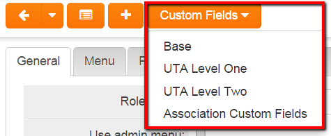
There are three types of custom fields that you can associate with a role.
- Base Custom Fields – these fields are always associated with the role.
- UTA Custom Fields – these fields are only used when you associate a contact with the role in the context of a Universal Tracking Application.
- Association Custom Fields – these fields are only used when you associate a contact with the role in the context of associating a contact with an organisation.
3. Click the Base Custom Fields tab.
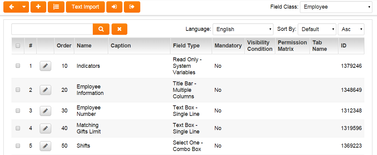
The custom field list is displayed – currently blank.
4. Click the New Field tab.
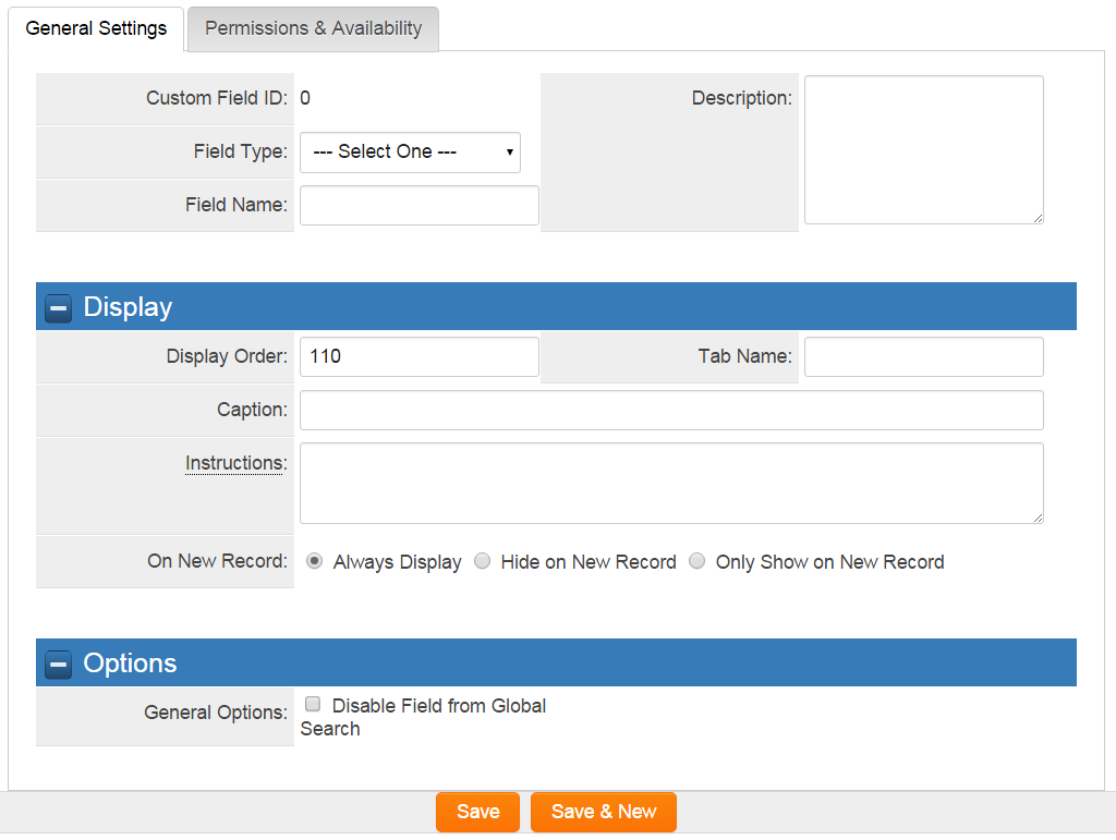
The New Custom Field window is displayed.
This window consists of the following settings:
General Settings
- Field Type - defines the content type for the field.
- Field Name – the name for the custom field. This name will also function as the caption unless the caption is set.
- Description - a general description for the custom field
Display
- Display Order - determines the order in which the fields will be displayed on the page. The display order will start at the number 10 and increment by 10 for each custom field. The display order can be changed at any time without affecting any data.
- Tab Name – by adding a tab name, the custom field will be displayed on a tab of the same name at the top of the form. This technique reduces the length of the page. You can use multiple tabs and each field will be displayed under the associated tab.
- Caption – an alternative caption to the field name. If a caption is set it will be displayed rather than the field name.
- Caption Location – define how the caption will be displayed . Options include "Left of Field", "Above Field", "No Caption", and "Hide Caption".
- Instructions – define text that will appear under or alongside the caption. Is displayed even if Hide Caption is chosen for Caption.
- Tool Tip – define text that will as a tool-tip against the field name or caption.
- On New Record - define how the custom field will be displayed on a new record. Options "Always Display", "Hide on New Record", "Only Show on New Record".
- SmartFields View - used to define those Custom Fields to be included and / or excluded in the SmartField list. Options are "Include", "Exclude", "Only display for SmartFields View".
- SmartFields PDF Formatting - used to define whether there should be page breaks and changes in page orientation when the field is pulled into SmartField PDF document.
Options
The Options field displayed below the field type will change depending on the field type selected.
- For Select one or Multiple select type fields this will contain the list of selection options – separated by semi-colons.
- For Text type custom fields, this can contain a default value for the field, or an instruction as to the purpose of the field.
- For Calculated fields, this contains the expression.
- For a multiple column layout, a Title Label field is used and the default value is set to the number of columns required.
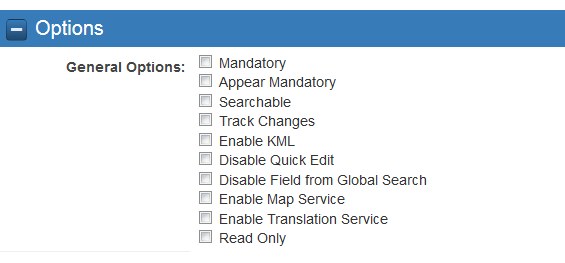
Options for text and select type fields
- The Mandatory check box is displayed for text and select type fields, and controls if data is mandatory in that field.
- Appear Mandatory: Makes the field appear as through it required even though "Allow Empty" is selected.
- Searchable - the Searchable check box is used to make the field value appear in the system search.
- Track Changes – this setting is used to indicate that all changes to the value in field should be tracked. This tracking includes the original and replacement value, the username and the date/time that the change was made.
- Enable KML - allows KML data (for mapping applications) to be used.
- Disable Quick Edit - checking this box will disable the "Quick Edit" feature.
- Disable Field from Global Search - this option is used to make the field value appear in Global Searches.
- Enable Map Service - displays the map icon next to the field name. This icon will launch the user’s selected map service and display a map of the content of the field – provided a valid address is stored in the field.
- Enable Translation Service - allows for language translation of data entered into text fields, achieved by integration with Google Translate.
- Read Only - uncheck this box to allow users to edit this field.
In order to see the changes a user needs to be in a role associated with the Manager Permission – View Custom Field Changes. When in this role an icon is displayed next to the field caption.
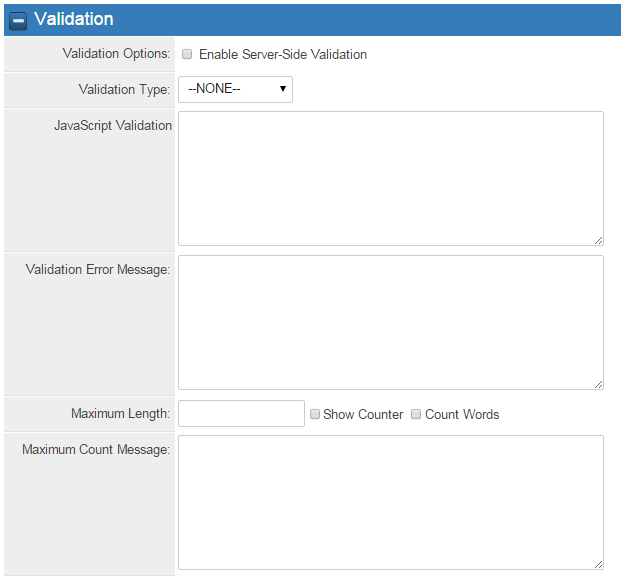
Validation Settings
The Validation fields displayed below the field type will change depending on the field type selected.
You can control the validation of any text type custom field.
- Validation Options - check-mark enables Server-Side Validation allowing for consolidated validation error messages to be displayed.
- Validation Type - options include "date", "numeric", and "alphabetic" validation. If you select date validation, a calendar icon will be displayed to the right of the field name automatically.
- Javascript Validation - allows you to set input masks for the field. For example >100 or @value@>100 would restrict the value entered to greater than 100. To validate 9 digits SIN number, isMatch(@value@, 'NNNNNNNNN', false). See the SmartSimple wiki for additional examples.
- Validation Error Message - will display a field specific message if the validation criteria are not met.
- For more advanced page level validations you can use the Custom Field – Special Browser Script to add a specific script to any page.
- Maximum Count Message - sets the maximum character count for the field. Options include check boxes to Show Counter which will display the character count and Count Words which will change from counting characters to counting words.
- Maximum Count Message - will display a field specific message if the Maximum Count Message criteria is not met.
Values Storage
Comprised of 2 parts
- From Custom Field(s): Displays the name of the source field that its pulling data from this field. Will be read-only
- To Custom Field: This setting will take the value for the current field and store it into another field associated with the same entity. For example, you may need two fields, one captioned in English and another captioned in French, but need to store the value into a single field.
Note: Please see the article Value Stores To for additional details.
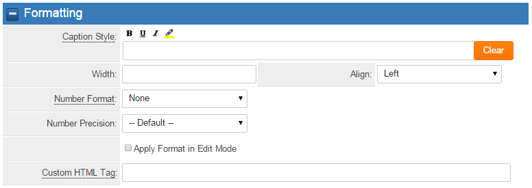
Formatting Settings
The formatting settings control the presentation of text type fields.
- Caption Style – controls the bold, underline, italic and highlight attribute when the field is displayed in view mode.
- Note: For Caption Style, put @value@ inside html style tags like @value@
- Width – controls the width of the next box.
- Number Format – controls the format of the data when the field is displayed in View mode. You can use standard setting such as Integer, Decimal, Currency, Percent or custom formats such as $#,###.00.
- Number Precision - control how many decimal places are displayed for numbers.
- Tool Tip – define text that will as a tool-tip against the field name or caption.
- Align - control the justification of the text within the field.
- Custom HTML Tag - Use this field for additional attributes to the field HTML tag. For Example: style="background-color=00ff00" or onfocus="this.value='Populate this text in field when selected'"
Permissions & Availability
Access to a custom field is controlled by role based permissions.
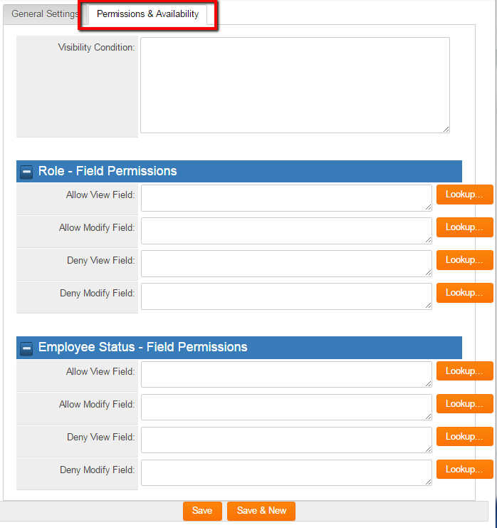
To access the Role and Status access settings click on the Permissions & Availability tab next to the General Settings.
Field permissions can be controlled by role and by status.
- Allow View Field – If you associate this setting with roles, then the field will only be displayed to people with these roles. If you leave this field blank, then everyone will be able to see the field.
- Allow Modify Field – If you associate this setting with roles, then the field will only be modifiable by people with these roles. If you leave this field blank, then everyone will be able to modify the value on the field.
- Deny View Field – If you associate this setting with roles, then the field will not be displayed to people with these roles. If you leave this field blank, then everyone will be able to see the field.
- Deny Modify Field – If you associate this setting with roles, then the field will not be modifiable by people with these roles. If you leave this field blank, then everyone will be able to modify the value on the field.
Creating Custom Fields
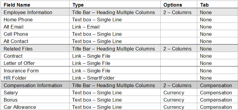
1. Create the following fields for the employee role you have previously established:
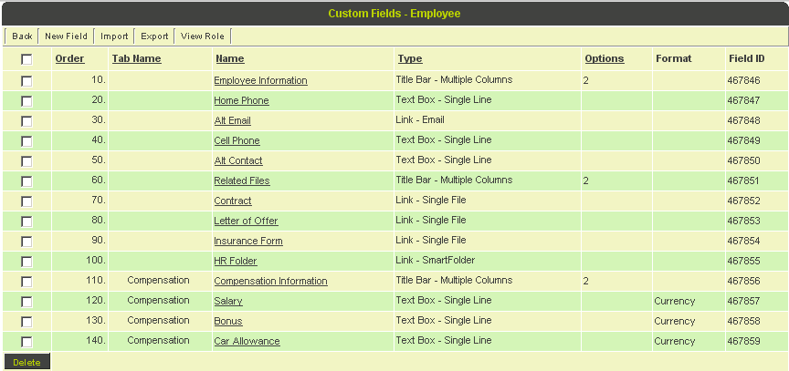
The completed field list will look as follows:
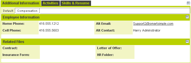
2. Review an Employee record and set the fields as shown below:
3. Select the Compensation fields.
Moving Custom Fields to Common level
If a client wishes to move a field under any of the circumstances listed below then there is now a button on both Custom Field list view and edit Custom Field page to Move to Common level.
- from a specific UTA Type to common UTA field
- from a User Role to common User field
- from an Organization Category to common Organization field hen there is now a button on both custom field list view and edit custom field page to Move to Parent level.
It will use the same Display order as before, meaning that fields should continue to be displayed in the original location on screen.
