Difference between revisions of "Configuring Ajax List Views"
(→Sort Order and Export Tabs) |
Lorena Ruiz (talk | contribs) (→Definition of Options Available on the Columns Tab) |
||
| (15 intermediate revisions by 3 users not shown) | |||
| Line 1: | Line 1: | ||
| − | + | __TOC__ | |
| − | Ajax | + | Ajax [[list view]]s can be configured to choose the fields shown when contact or organization records are searched for using [[Ajax]] lookups. |
| − | + | Unlike other [[list view]]s in the system, records shown on Ajax list views cannot be edited or opened. Ajax list views present information on records for selection of contacts or organizations. | |
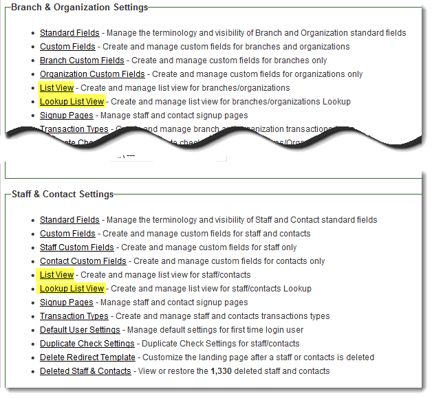
| − | + | The list views are configured from the [[Global Settings]] page under the following tabs: | |
| − | |||
| − | |||
| − | = | + | [[Image:ConsolidatedAjaxListViewsonGlobalSettingsPage.png|link=|600px]] |
| − | + | Note that the columns selected in the Ajax list view will be the fields searched upon when values are typed into an Ajax lookup field.<br />For example, when a contact lookup list view is configured with the Name, Organization, Title and Address columns, and "art" is typed into a contact lookup field, records will be returned where the string "art" is found in any of those fields: | |
| − | |||
| − | |||
| + | [[Image:AjaxLookup.png|link=]] | ||
| − | + | <!--When you click on one of the above links, you will be given a choice to build the list view using either the Classic or the New List View Builder. | |
| − | [[Image: | + | |
| − | + | [[Image:ChooseListViewBuilder.png|link=|200px]] | |
| − | + | ||
| − | + | For instructions on use of the Classic List View Builder, see the following page: [[Historic List View]]. | |
| − | + | ||
| − | + | To configure a New List View, click on the "Use New ListView Builder" option and follow these steps:--> | |
| − | |||
| − | |||
| − | |||
==The Columns Tab== | ==The Columns Tab== | ||
| Line 31: | Line 25: | ||
* When you first click on this tab, you will see the default four blank columns. | * When you first click on this tab, you will see the default four blank columns. | ||
<BR><br> | <BR><br> | ||
| − | [[Image: | + | [[Image:AjaxListViewBuilderInitialView.png|link=]] |
* When you click into a cell, you will see the configuration options below. Note that the '''Available Field List''' will display at the right. [[Standard Fields|Standard]] fields are shown first, followed by the [[Custom Fields|custom]] fields available. | * When you click into a cell, you will see the configuration options below. Note that the '''Available Field List''' will display at the right. [[Standard Fields|Standard]] fields are shown first, followed by the [[Custom Fields|custom]] fields available. | ||
| − | |||
| − | |||
| − | |||
| − | |||
* You can quickly click through the cells and use the Available Field List to choose the fields you wish to display. | * You can quickly click through the cells and use the Available Field List to choose the fields you wish to display. | ||
* When you select a field from the Available Field List, the '''Content Template''' will be populated with a SmartSimple [[variable]] that references that field. | * When you select a field from the Available Field List, the '''Content Template''' will be populated with a SmartSimple [[variable]] that references that field. | ||
| − | * In the example below, the | + | * Note that multiple fields can be selected for each column in the list view. In the example below, both the First Name and Last Name standard fields have been added to column number 2 and the Header Caption has been changed to "Name." |
| − | |||
| − | |||
| + | [[Image:AjaxListViewBuilder.png|link=]] | ||
| − | |||
* First, click into an Active Cell and click on the fields you want to display in the column in the Available Field List. | * First, click into an Active Cell and click on the fields you want to display in the column in the Available Field List. | ||
| − | * | + | * You can also add extra characters, such as parentheses and explanatory text. |
| − | |||
| − | |||
| − | |||
* HTML tags can also be employed, surrounding the variable(s) in the Content Template, to add formatting to the column values. | * HTML tags can also be employed, surrounding the variable(s) in the Content Template, to add formatting to the column values. | ||
| − | * An example would be entering ''<nowiki>@ | + | * An example would be entering ''<nowiki>@First Name@ <b>(@Last Name@)</b></nowiki>'' into the Content Template, which would result in Name values in the list view displaying in the format: FirstName '''LastName''' |
<pre style="white-space: pre-wrap; | <pre style="white-space: pre-wrap; | ||
| Line 61: | Line 46: | ||
word-wrap: break-word;">Note: Since the configuration of list views is performed by system administrators, any field can be selected to display in the list view. This means that if a field is selected for a given role's list view that has field permissions that deny visibility to that given role, that field will be visible to that role on that list view. The edit permissions set on the field permissions setting of custom fields will still hold sway, however.</pre> | word-wrap: break-word;">Note: Since the configuration of list views is performed by system administrators, any field can be selected to display in the list view. This means that if a field is selected for a given role's list view that has field permissions that deny visibility to that given role, that field will be visible to that role on that list view. The edit permissions set on the field permissions setting of custom fields will still hold sway, however.</pre> | ||
| − | |||
| − | |||
| − | |||
| − | |||
| − | |||
| − | |||
| − | |||
| − | |||
===Definition of Options Available on the Columns Tab=== | ===Definition of Options Available on the Columns Tab=== | ||
| − | * '''Number of Columns''' - This is the total number of columns visible in your list view. You can add or subtract the number of columns shown by editing this value and clicking out of the field. | + | * '''Number of Columns''' - This is the total number of columns visible in your list view. You can add or subtract the number of columns shown by editing this value and clicking out of the field.<br /> |
| + | For an optimal user experience, it is recommended to not exceed 4 columns, however you can exceed this limit. | ||
* '''Header Caption''' - You can choose the name of the columns in your list view using the Header Caption option. | * '''Header Caption''' - You can choose the name of the columns in your list view using the Header Caption option. | ||
* '''Content Template''' - This will display the [[Variables|variable]] or variables you have selected using the Available Field List. | * '''Content Template''' - This will display the [[Variables|variable]] or variables you have selected using the Available Field List. | ||
* '''Align''' - This will determine the alignment of the values in your list view column. The options available are "Left," "Right," and "Center." | * '''Align''' - This will determine the alignment of the values in your list view column. The options available are "Left," "Right," and "Center." | ||
| − | |||
| − | |||
* '''Shift Column Position''' - This will move the currently selected column to the left or right, relative to the other columns. | * '''Shift Column Position''' - This will move the currently selected column to the left or right, relative to the other columns. | ||
| − | ==Sort Order | + | ==Sort Order== |
| − | |||
| − | |||
| − | Please | + | Now that the list view has been created and the fields that should be presented have been defined, you will define the Sort Order for your list view. Please see [[Setting the Sort Order on a List View]] for instructions. |
| − | + | ==See Also== | |
* [[Ajax|Ajax Lookup]] | * [[Ajax|Ajax Lookup]] | ||
| − | + | [[Category:List Views]][[Category:Global Settings]] | |
Latest revision as of 10:04, 27 February 2018
Contents
Ajax list views can be configured to choose the fields shown when contact or organization records are searched for using Ajax lookups.
Unlike other list views in the system, records shown on Ajax list views cannot be edited or opened. Ajax list views present information on records for selection of contacts or organizations.
The list views are configured from the Global Settings page under the following tabs:
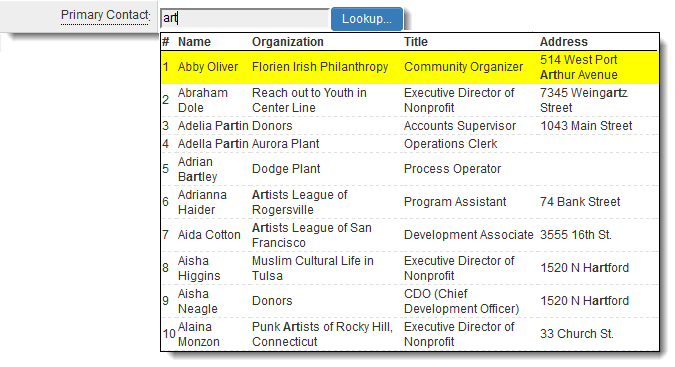
Note that the columns selected in the Ajax list view will be the fields searched upon when values are typed into an Ajax lookup field.
For example, when a contact lookup list view is configured with the Name, Organization, Title and Address columns, and "art" is typed into a contact lookup field, records will be returned where the string "art" is found in any of those fields:
The Columns Tab
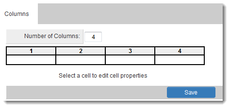
- The Columns tab is where the standard and custom fields that you want to be displayed in your list view are defined.
- When you first click on this tab, you will see the default four blank columns.
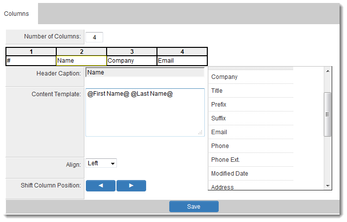
- When you click into a cell, you will see the configuration options below. Note that the Available Field List will display at the right. Standard fields are shown first, followed by the custom fields available.
- You can quickly click through the cells and use the Available Field List to choose the fields you wish to display.
- When you select a field from the Available Field List, the Content Template will be populated with a SmartSimple variable that references that field.
- Note that multiple fields can be selected for each column in the list view. In the example below, both the First Name and Last Name standard fields have been added to column number 2 and the Header Caption has been changed to "Name."
- First, click into an Active Cell and click on the fields you want to display in the column in the Available Field List.
- You can also add extra characters, such as parentheses and explanatory text.
- HTML tags can also be employed, surrounding the variable(s) in the Content Template, to add formatting to the column values.
- An example would be entering @First Name@ <b>(@Last Name@)</b> into the Content Template, which would result in Name values in the list view displaying in the format: FirstName LastName
Note: Since the configuration of list views is performed by system administrators, any field can be selected to display in the list view. This means that if a field is selected for a given role's list view that has field permissions that deny visibility to that given role, that field will be visible to that role on that list view. The edit permissions set on the field permissions setting of custom fields will still hold sway, however.
Definition of Options Available on the Columns Tab
- Number of Columns - This is the total number of columns visible in your list view. You can add or subtract the number of columns shown by editing this value and clicking out of the field.
For an optimal user experience, it is recommended to not exceed 4 columns, however you can exceed this limit.
- Header Caption - You can choose the name of the columns in your list view using the Header Caption option.
- Content Template - This will display the variable or variables you have selected using the Available Field List.
- Align - This will determine the alignment of the values in your list view column. The options available are "Left," "Right," and "Center."
- Shift Column Position - This will move the currently selected column to the left or right, relative to the other columns.
Sort Order
Now that the list view has been created and the fields that should be presented have been defined, you will define the Sort Order for your list view. Please see Setting the Sort Order on a List View for instructions.