Difference between revisions of "Branding"
Mark Bridger (talk | contribs) |
Mark Bridger (talk | contribs) (→Colors and Styles) |
||
| (121 intermediate revisions by 3 users not shown) | |||
| Line 1: | Line 1: | ||
=Overview= | =Overview= | ||
| − | As part of the implementation process, SmartSimple or its partners typically configure the look and feel of your system | + | As part of the implementation process, SmartSimple or its partners typically configure the look and feel of your system. If you have '''Global Administrator''' privileges, you can change the look and feel of your system at any time. This article explains how to upload logos and change the system colors to align your system with your brand. |
| − | [[File:branding- | + | The branding settings affect multiple areas of the system. |
| − | [[File:branding- | + | |
| + | [[File:branding-listview-2020.png|thumb|none|800px|List View page as seen by Administrator]] | ||
| + | |||
| + | [[File:branding-object-2020.png|thumb|none|800px|Object View page as seen by Administrator]] | ||
| + | |||
| + | [[File:branding-settings-2020.png|thumb|none|800px|Settings page as seen by Administrator]] | ||
| + | |||
| + | [[File:branding-portal-2020.png|thumb|none|800px|Portal home page as seen by an applicant]] | ||
=Configuration - Essentials= | =Configuration - Essentials= | ||
| Line 11: | Line 18: | ||
You can upload a logo that will appear in the header for all users. This logo appears at the top left of all screens. Typically, people upload their organization’s logo, unless they have created a special logo for their system. If you don’t have a logo, you can enter text. | You can upload a logo that will appear in the header for all users. This logo appears at the top left of all screens. Typically, people upload their organization’s logo, unless they have created a special logo for their system. If you don’t have a logo, you can enter text. | ||
| − | [[File: | + | '''Note:''' Logos will appear in a container that is 40 pixels high x 200 pixels wide and as such fine text, details, taglines or longer wordmarks may be hard to read. We suggest using your organization's logo that is best suited for smaller spaces. |
| + | |||
| + | [[File:Branding-object-logo-2020.png|thumb|none|800px|Logo appears in the top left in the header of all pages.]] | ||
| + | |||
| + | [[File:Wiki-logos.jpg|thumb|none|800px|Example of organization logos suitable for large and small spaces. Note how elements are removed from logos intended for small spaces.]] | ||
| + | |||
| + | |||
===Logo Specifications=== | ===Logo Specifications=== | ||
{| class="wikitable" | {| class="wikitable" | ||
|- | |- | ||
| − | || | + | ||Dimensions |
| − | ||56 | + | ||112px high and 560px wide are the recommended dimensions. Logos will be sized down to appear at 56 pixels high or lower within the system. |
|- | |- | ||
||Format | ||Format | ||
| Line 27: | Line 40: | ||
===How to upload the logo=== | ===How to upload the logo=== | ||
| − | # Click on the ''' | + | # Click on the '''Menu''' icon which looks like 9 squares in the top right of the header. |
| − | + | ||
| − | + | ::: {{Icon-Menu}} | |
| − | + | : | |
| − | + | :* Select '''Global Settings'''. | |
| − | + | :* Click on the '''Branding''' tab. | |
| + | :* For '''Logo''' click on the '''Browse…''' button, which looks like an open folder and select the desired file you want to upload. | ||
| + | :* Click the '''Upload''' button to upload your submission. | ||
| + | :* Force a cache refresh on your browser (CTRL + F5 on PC, Cmd + R on Mac) to view your changes. | ||
==Favicon== | ==Favicon== | ||
| − | The favicon is short for Favorite Icon | + | The favicon is short for Favorite Icon. Depending on your browser and operating system, this icon may appear on your tabs, in your bookmarks, and on the user’s desktop. |
| − | [[File: | + | [[File:Branding-favicon-2020.png|thumb|none|800px|Favicon in browser tab]] |
===Favicon specifications=== | ===Favicon specifications=== | ||
{| class="wikitable" | {| class="wikitable" | ||
|- | |- | ||
| − | || | + | ||Dimensions |
||48 pixels high by 48 pixels wide. | ||48 pixels high by 48 pixels wide. | ||
|- | |- | ||
| Line 53: | Line 69: | ||
===How to upload the Favicon=== | ===How to upload the Favicon=== | ||
| − | # Click on the ''' | + | :# Click on the '''Menu''' icon which looks like 9 squares in the top right of the header. |
| − | # Select '''Global Settings'''. | + | :: {{Icon-Menu}} |
| − | # Click on the '''Branding''' tab. | + | : |
| − | # For '''Favicon''' click on the '''Browse…''' button which looks like an open folder and select the desired file. | + | :# Select '''Global Settings'''. |
| − | # Click the '''Upload''' button. | + | :# Click on the '''Branding''' tab. |
| − | # | + | :# For '''Favicon''' click on the '''Browse…''' button which looks like an open folder and select the desired file. |
| + | :# Click the '''Upload''' button. | ||
| + | :# Force a cache refresh on your browser (CTRL + F5 on PC, Cmd + R on Mac) to view your changes. | ||
| − | == | + | ==Logo Text== |
| − | + | The '''Logo Text''' setting is used to set the '''Alt''' text on the logo. The '''Alt''' text will appear if there is no image or if the image fails to load. This text is also used by assistive technology such as screen readers. | |
| − | |||
| − | |||
| − | |||
| − | |||
| − | |||
| − | + | [[File: Branding-logo-text.png|thumb|none|800px|Logo Text]] | |
| − | |||
| − | |||
| − | == | + | ==Header== |
| − | + | All clients were transitioned to the header below in the November 2021 upgrade. | |
| − | |||
| − | |||
| − | |||
| − | |||
| − | |||
| − | |||
| − | ===Color | + | [[File:standard-header-2021.png|thumb|none|800px|Main Heading area]] |
| + | |||
| + | ==Colors and Styles== | ||
| + | Beyond uploading image files, you can adjust the colors and some styles. If you choose to change the colors in your system, make sure you maintain a contrast ratio between fonts and backgrounds of 4.5 or greater to ensure you meet with accessibility standards (Section 508 and WCAG 2.0). The following tool may be used to check your contrast ratio [https://webaim.org/resources/contrastchecker/ contrast checker by webaim]. | ||
| + | |||
| + | '''Note:''' color settings affect multiple areas in the system, and all color settings affect all users. For example, the colors an administrator sees are the same as the colors an applicant sees. | ||
| + | |||
| + | ===How to modify the Colors and Styles=== | ||
| + | :# Click on the '''menu''' icon which looks like 9 squares in the top right of the header. | ||
| + | :: {{Icon-Menu}} | ||
| + | : | ||
| + | :# Select '''Global Settings'''. | ||
| + | :# Click on the '''Branding''' tab. | ||
| + | :# Click the '''Colors & Styles''' link. | ||
| + | :# Click on the desired color picker to choose a new color or enter a Hexadecimal value (example: #000000) or choose a style. | ||
| + | :# Click '''Save'''. | ||
| + | :# Force a cache refresh on your browser (CTRL + F5 on PC, Cmd + R on Mac) to view your change | ||
| + | |||
| + | ===Color and Styles settings explained=== | ||
====Global Settings==== | ====Global Settings==== | ||
{| class="wikitable" | {| class="wikitable" | ||
|- | |- | ||
| − | ||Mandatory Field Font | + | ||Mandatory Field Font |
| − | ||The color of all fields set as mandatory. Typically, the mandatory field color is set to a shade of red. | + | ||The color of all fields set as mandatory. Typically, the mandatory field color is set to #D81A01 which is a shade of red. This red has enough contrast to meet with Accessibility guidelines. |
|- | |- | ||
||Mandatory Field Style | ||Mandatory Field Style | ||
| − | ||Any question that is set as mandatory will be by default prefixed with an asterisk '''*'''. | + | ||Any question that is set as mandatory will be by default prefixed with an asterisk '''*''' and must be left like this for accessibility. You may change the caption color to the mandatory field color, instead of showing an asterisk but it is not recommended. |
|- | |- | ||
||Link | ||Link | ||
||The color of all text links. | ||The color of all text links. | ||
|- | |- | ||
| − | ||Link | + | ||Link Hover |
| − | ||The color displayed on text links when you mouse over the link | + | ||The color displayed on text links when you mouse hovers over the link. |
|- | |- | ||
||Link Underline | ||Link Underline | ||
| − | ||Any text links will be underlined by default. You have the option to turn off underlines. | + | ||Any text links will be underlined by default and must be left like this for accessibility. You do have the option to turn off the underlines but it is not recommended. |
|- | |- | ||
||Button Font | ||Button Font | ||
| − | || | + | ||The color used by text and icons inside buttons. This should be set to white or a light color. |
|- | |- | ||
||Button Background | ||Button Background | ||
| − | ||Buttons will be this color. | + | ||Buttons will be this color. This should be set to a dark color for contrast. Popular colors are blue, grey or purple. Red and green are generally avoided as they are associated with error and success messaging. |
|- | |- | ||
| − | ||Button | + | ||Button Hover |
| − | || | + | ||May be used to change the button color on hover (mouse over). |
|- | |- | ||
||Highlight | ||Highlight | ||
| − | ||When the user clicks into an input | + | ||When the user clicks into an input or tabs to an input the focus will move to that input. When an input is in focus that input background will change from white to the color chosen in this setting. This setting gives an extra layer of visibility and differentiation for the currently selected input. This must be set to a light tint, example yellow such as #F7F4DA. Do not set this color to a grey as the "X" used to clear inputs will not show up. |
| + | |- | ||
| + | ||Save Button Color | ||
| + | ||Choose the desired style for Save buttons on record pages. | ||
| + | |- | ||
| + | ||Delete Button Color | ||
| + | ||Choose the desired style for Delete buttons on record pages. | ||
|} | |} | ||
====Main Heading Settings==== | ====Main Heading Settings==== | ||
| − | [[File:branding-main-heading- | + | [[File:branding-main-heading-2022.png|thumb|none|800px|Main Heading]] |
| − | |||
| − | |||
{| class="wikitable" | {| class="wikitable" | ||
|- | |- | ||
||Font | ||Font | ||
| − | || | + | ||Font color for main menu links and icons located in the header. |
|- | |- | ||
||Background | ||Background | ||
| − | ||The header background uses this color. The logo will appear over this color, as will the other text in the header. Typically, a dark color looks best for the header. | + | ||The header background uses this color. The logo will appear over this color, as will the other text in the header. Typically, a dark color looks best for the header. Make sure there is a contrast ratio of 4.5 or greater between the background color and the font setting to ensure accessibility. |
| − | |||
| − | |||
| − | |||
|} | |} | ||
====Navigation Settings==== | ====Navigation Settings==== | ||
| − | [[File:branding-nav- | + | [[File:branding-left-nav-2022.png|thumb|none|800px|Left Navigation]] |
{| class="wikitable" | {| class="wikitable" | ||
|- | |- | ||
| − | || | + | ||Font |
| − | ||Text color on the user menu and on the | + | ||Text color on the user menu and on the left navigation. |
|- | |- | ||
| − | || | + | ||Background |
| − | || | + | ||Color behind the text on the left navigation. |
| − | |||
| − | |||
| − | |||
| − | |||
| − | |||
| − | |||
|} | |} | ||
====Title Settings==== | ====Title Settings==== | ||
| − | [[File: | + | This section controls the display of the title areas found in areas like the personal dashboard and on portal sections using the traditional theme. |
| + | |||
| + | [[File:Branding-title-2020.png|thumb|none|800px|Title Settings Area appears on portal sections set to the default theme]] | ||
{| class="wikitable" | {| class="wikitable" | ||
|- | |- | ||
||Font | ||Font | ||
| − | || | + | ||Title text color. Typically set to a dark color or #000000. |
|- | |- | ||
||Background | ||Background | ||
| − | ||The background title | + | ||The background color of the title area. Typically set to a light color or #EEEEEE. |
| − | |||
| − | |||
| − | |||
|- | |- | ||
||Bottom Border | ||Bottom Border | ||
| − | ||If you want a line under the title bar of a portal section to give more separation use this setting. Typically, it is the same color as the background to give a flat look but sometimes a slightly darker shade of the same color is used here. | + | ||If you want a line under the title bar of a portal section of the theme Traditional to give more separation, use this setting. Typically, it is the same color as the background to give a flat look but sometimes a slightly darker shade of the same color is used here such as #CCCCCC. |
|} | |} | ||
====Sub-Title Settings==== | ====Sub-Title Settings==== | ||
| − | [[File: | + | [[File:Branding-titlebar-2020.png|thumb|none|800px|Layout - Title Bar custom field as seen on object pages]] |
| + | [[File:Branding-title-settings-2020.png|thumb|none|800px|Heading as seen by administrators seen on setting pages]] | ||
{| class="wikitable" | {| class="wikitable" | ||
|- | |- | ||
||Font | ||Font | ||
| − | ||Text color for | + | ||Text color for title bars and headings in the system. Typically set to a dark grey or #000000. |
|- | |- | ||
||Bottom Border | ||Bottom Border | ||
| − | ||Underline color for | + | ||Underline color for title bars and headings in the system. Typically set to a color or light shade of grey. |
|} | |} | ||
====List Settings==== | ====List Settings==== | ||
| − | [[File: | + | [[File:Branding-listview-2020-highlight.png|thumb|none|800px|List Settings Area]] |
{| class="wikitable" | {| class="wikitable" | ||
|- | |- | ||
||Heading Font | ||Heading Font | ||
| − | ||Text color for table headers. Typically | + | ||Text color for table headers. Typically a dark color such as the button color background is used here. Do not use white as column headers and tables will not show up in some areas of the system. |
|- | |- | ||
||Heading Background | ||Heading Background | ||
| − | ||Table Header color. Typically | + | ||Table Header background color. Typically a version of the header color at around 15% opacity. Note the header font and background color inverse when the header of a column is clicked. The sorting icons for list views are an opacity of the Heading Font, so be mindful of accessibility standards for color contrast. |
|- | |- | ||
||Top Border | ||Top Border | ||
| − | || | + | ||Display options for the line at the top of each row in the table to give differentiation between rows. Typically set to a 1px solid FFFFFF (which is white). |
|- | |- | ||
||Bottom Border | ||Bottom Border | ||
| − | || | + | ||Display options for the line at the bottom of each row in the table to give differentiation between rows. Typically set to a 1px solid CCCCCC (which is a light grey). |
|} | |} | ||
=Configuration - Advanced= | =Configuration - Advanced= | ||
| − | ==Importing/Exporting Colors | + | ==Importing/Exporting Colors and Styles== |
| − | You can import and export your colors and styles settings from one | + | You can import and export your colors and styles settings from one environment to another, or save a copy of your colors and styles for archival purposes. For example, you can make changes and test them on your backup environment and when you are happy, apply all your changes at once to your production environment system. |
===How to export and import colors and styles between systems=== | ===How to export and import colors and styles between systems=== | ||
| − | # Click on the ''' | + | :# Click on the '''Menu''' icon which looks like 9 squares in the top right of the header. |
| − | # Select '''Global Settings'''. | + | :: {{Icon-Menu}} |
| − | # Click on the '''Branding''' tab. | + | : |
| − | # Click the '''Colors & Styles''' link. | + | :# Select '''Global Settings'''. |
| − | # In the action bar located near the header click on the '''Export Styles''' button. | + | :# Click on the '''Branding''' tab. |
| − | # A modal window will open. Copy the code in the modal window. | + | :# Click the '''Colors & Styles''' link. |
| − | # Go to the system where you want to apply these styles. | + | :# In the action bar located near the header click on the '''Export Styles''' button. |
| − | # Follow steps 1 to 4 above. | + | :# A modal window will open. Copy the code in the modal window. |
| − | # In the action bar located near the header, click on the '''Import Styles''' button. | + | :# Go to the system where you want to apply these styles. |
| − | # Paste the styles you copied into the modal window of the desired system. | + | :# Follow steps 1 to 4 above. |
| − | # Click the '''Import Styles''' button on the bottom of the modal window. | + | :# In the action bar located near the header, click on the '''Import Styles''' button. |
| − | # Click '''OK''' on the alert. | + | :# Paste the styles you copied into the modal window of the desired system. |
| − | # Close | + | :# Click the '''Import Styles''' button on the bottom of the modal window. |
| − | # Click '''Save'''. | + | :# Click '''OK''' on the alert. |
| − | # | + | :# Close the modal window. |
| + | :# Click '''Save'''. | ||
| + | :# Force a cache refresh on your browser (CTRL + F5 on the PC, Cmd + R on Mac) to view your changes. | ||
| + | |||
| + | ===Sample colors and styles file=== | ||
| + | Here is a sample color and styles file you can download and import into your system. It will give you a blue header like the screenshots in this wiki. | ||
| + | |||
| + | [[File:Sample-colors-styles.txt]] | ||
| + | |||
| + | ==Tip: Uploading images== | ||
| + | When you upload images to your system, always size the images to the desired dimensions and save to the desired file format with compression. Image optimization is typically done in photo editing software such as Adobe Photoshop. Take the time to ensure your image files are 1 MB or less. Larger images can take several seconds to download and may cause a noticeable delay while pages load. | ||
| + | |||
| + | Note an image saved a 72 pixels per inch (ppi), 240 ppi and 500 ppi will all look the same if viewed at 200 pixels by 200 pixels. The quality of each version of image is exactly the same when viewed on screen. The higher ppi versions have a much higher file size which means your users may have to wait unnecessarily and use more data, but the higher ppi makes no difference to image quality on screen. | ||
| + | So, if the image you are uploading is intended to be printed in a PDF, then a higher resolution is ok such as 150 or 300 dpi (dots per inch), but if the image is going to be used as a background in a portal or the login page a smaller resolution such as 72 ppi is recommended. | ||
| − | |||
| − | |||
| − | + | In regards to file formats JPG and PNG are the best options for your system. | |
| − | Joint Photographic Experts Group | + | '''JPG/JPEG''' Joint Photographic Experts Group is a lossy format best for images of people, landscapes, and realistic photography. |
| − | Portable Network Graphics | + | '''PNG''' Portable Network Graphics is a lossless format that supports transparency and is best suited for logos, graphics, and icons. |
==Tip: Sourcing imagery== | ==Tip: Sourcing imagery== | ||
| − | Don’t have photos to use in your | + | Don’t have photos to use in your system? Here are some websites that offer copyright-free stock photos for commercial use. Find the images you want, crop and size the images then upload them into your system. |
| − | https://unsplash.com/ | + | * [https://unsplash.com/ Unsplash] |
| − | https://gratisography.com/ | + | * [https://gratisography.com/ Gratisography] |
| − | https://morguefile.com/ | + | * [https://morguefile.com/ Morguefile] |
| − | https://pixabay.com/ | + | * [https://pixabay.com/ Pixabay] |
| − | https://www.stockvault.net/ | + | * [https://www.stockvault.net/ Stockvault] |
| − | https://www.pexels.com/ | + | * [https://www.pexels.com/ Pexels] |
| − | https://picjumbo.com/ | + | * [https://picjumbo.com/ Picjumbo] |
| − | https://www.rawpixel.com/ | + | * [https://www.rawpixel.com/ Raw Pixel] |
| − | https://www.reshot.com/ | + | * [https://www.reshot.com/ Reshot] |
You may also want to check out the following paid stock photo sites. | You may also want to check out the following paid stock photo sites. | ||
| − | https://www.iStockphoto.com | + | * [https://www.iStockphoto.com iStock Photo] |
| + | |||
| + | * [https://www.Shutterstock.com Shutterstock] | ||
| + | |||
| + | |||
| + | For free icons | ||
| + | |||
| + | * [https://www.flaticon.com/ Flaticon] | ||
| − | |||
[[Category:Interface]] | [[Category:Interface]] | ||
Latest revision as of 17:56, 2 February 2024
Contents
Overview
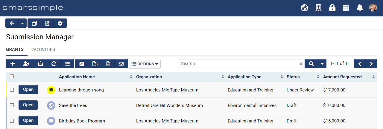
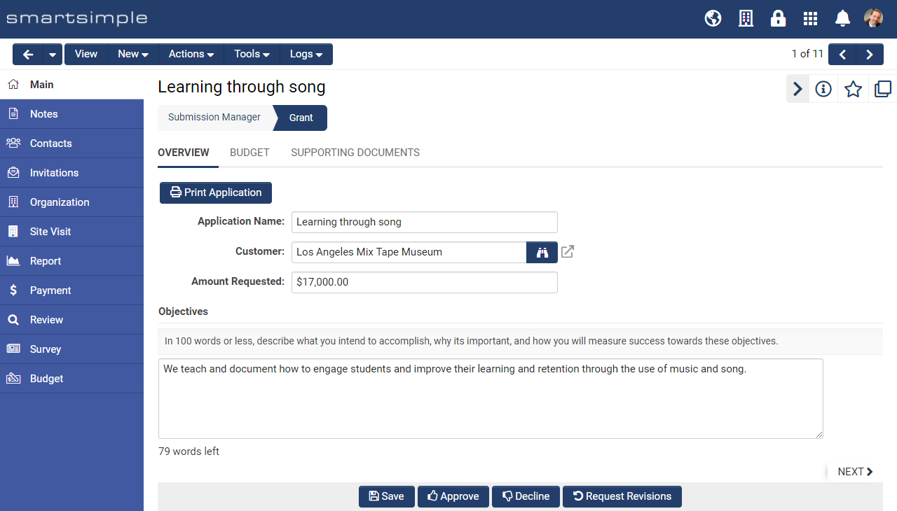
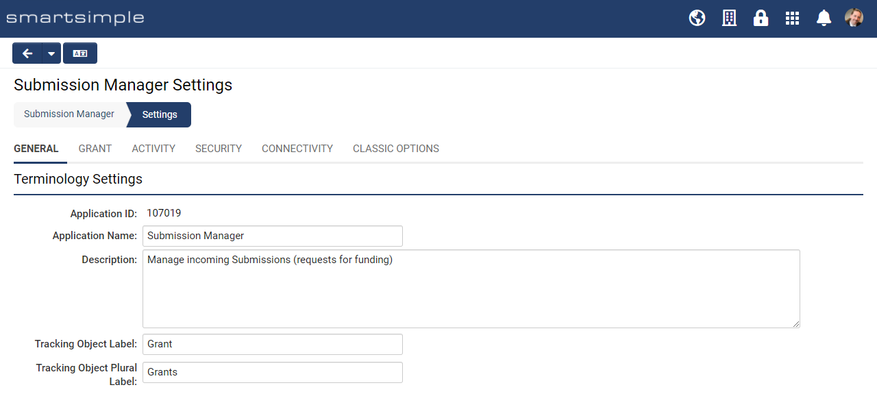
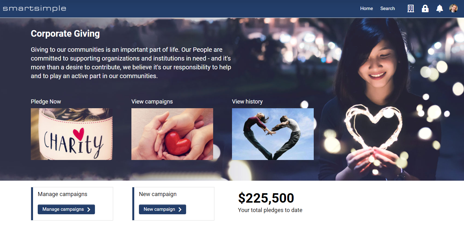
As part of the implementation process, SmartSimple or its partners typically configure the look and feel of your system. If you have Global Administrator privileges, you can change the look and feel of your system at any time. This article explains how to upload logos and change the system colors to align your system with your brand.
The branding settings affect multiple areas of the system.
Configuration - Essentials
You must have Global Administrator access to modify the systems logo and colors.
Logo
You can upload a logo that will appear in the header for all users. This logo appears at the top left of all screens. Typically, people upload their organization’s logo, unless they have created a special logo for their system. If you don’t have a logo, you can enter text.
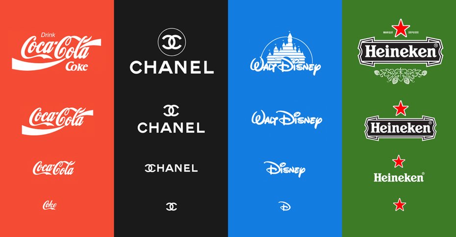
Note: Logos will appear in a container that is 40 pixels high x 200 pixels wide and as such fine text, details, taglines or longer wordmarks may be hard to read. We suggest using your organization's logo that is best suited for smaller spaces.
Logo Specifications
| Dimensions | 112px high and 560px wide are the recommended dimensions. Logos will be sized down to appear at 56 pixels high or lower within the system. |
| Format | PNG on a transparent background recommended. JPG and GIF are also accepted. |
| File Size | 10 – 20 KB is recommended. |
How to upload the logo
- Click on the Menu icon which looks like 9 squares in the top right of the header.
-
- Select Global Settings.
- Click on the Branding tab.
- For Logo click on the Browse… button, which looks like an open folder and select the desired file you want to upload.
- Click the Upload button to upload your submission.
- Force a cache refresh on your browser (CTRL + F5 on PC, Cmd + R on Mac) to view your changes.
Favicon
The favicon is short for Favorite Icon. Depending on your browser and operating system, this icon may appear on your tabs, in your bookmarks, and on the user’s desktop.
Favicon specifications
| Dimensions | 48 pixels high by 48 pixels wide. |
| Format | PNG or ICO is recommended. |
| File Size | 5 – 10 KB is recommended. |
How to upload the Favicon
- Click on the Menu icon which looks like 9 squares in the top right of the header.
-
- Select Global Settings.
- Click on the Branding tab.
- For Favicon click on the Browse… button which looks like an open folder and select the desired file.
- Click the Upload button.
- Force a cache refresh on your browser (CTRL + F5 on PC, Cmd + R on Mac) to view your changes.
Logo Text
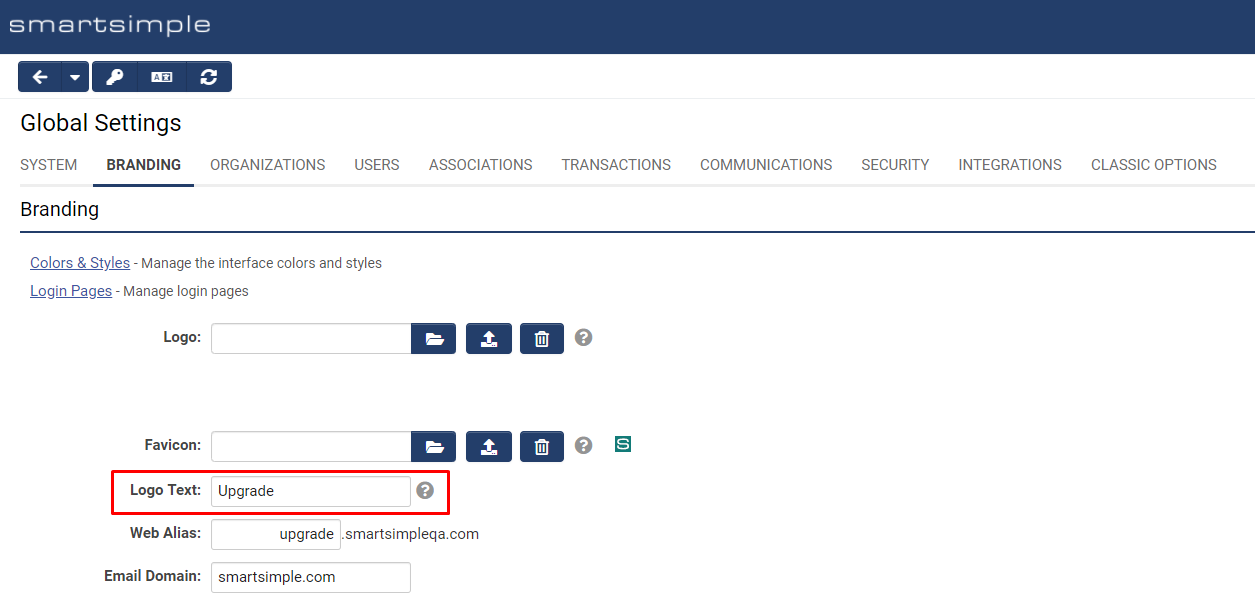
The Logo Text setting is used to set the Alt text on the logo. The Alt text will appear if there is no image or if the image fails to load. This text is also used by assistive technology such as screen readers.
Header
All clients were transitioned to the header below in the November 2021 upgrade.
Colors and Styles
Beyond uploading image files, you can adjust the colors and some styles. If you choose to change the colors in your system, make sure you maintain a contrast ratio between fonts and backgrounds of 4.5 or greater to ensure you meet with accessibility standards (Section 508 and WCAG 2.0). The following tool may be used to check your contrast ratio contrast checker by webaim.
Note: color settings affect multiple areas in the system, and all color settings affect all users. For example, the colors an administrator sees are the same as the colors an applicant sees.
How to modify the Colors and Styles
- Click on the menu icon which looks like 9 squares in the top right of the header.
-
- Select Global Settings.
- Click on the Branding tab.
- Click the Colors & Styles link.
- Click on the desired color picker to choose a new color or enter a Hexadecimal value (example: #000000) or choose a style.
- Click Save.
- Force a cache refresh on your browser (CTRL + F5 on PC, Cmd + R on Mac) to view your change
Color and Styles settings explained
Global Settings
| Mandatory Field Font | The color of all fields set as mandatory. Typically, the mandatory field color is set to #D81A01 which is a shade of red. This red has enough contrast to meet with Accessibility guidelines. |
| Mandatory Field Style | Any question that is set as mandatory will be by default prefixed with an asterisk * and must be left like this for accessibility. You may change the caption color to the mandatory field color, instead of showing an asterisk but it is not recommended. |
| Link | The color of all text links. |
| Link Hover | The color displayed on text links when you mouse hovers over the link. |
| Link Underline | Any text links will be underlined by default and must be left like this for accessibility. You do have the option to turn off the underlines but it is not recommended. |
| Button Font | The color used by text and icons inside buttons. This should be set to white or a light color. |
| Button Background | Buttons will be this color. This should be set to a dark color for contrast. Popular colors are blue, grey or purple. Red and green are generally avoided as they are associated with error and success messaging. |
| Button Hover | May be used to change the button color on hover (mouse over). |
| Highlight | When the user clicks into an input or tabs to an input the focus will move to that input. When an input is in focus that input background will change from white to the color chosen in this setting. This setting gives an extra layer of visibility and differentiation for the currently selected input. This must be set to a light tint, example yellow such as #F7F4DA. Do not set this color to a grey as the "X" used to clear inputs will not show up. |
| Save Button Color | Choose the desired style for Save buttons on record pages. |
| Delete Button Color | Choose the desired style for Delete buttons on record pages. |
Main Heading Settings
| Font | Font color for main menu links and icons located in the header. |
| Background | The header background uses this color. The logo will appear over this color, as will the other text in the header. Typically, a dark color looks best for the header. Make sure there is a contrast ratio of 4.5 or greater between the background color and the font setting to ensure accessibility. |
| Font | Text color on the user menu and on the left navigation. |
| Background | Color behind the text on the left navigation. |
Title Settings
This section controls the display of the title areas found in areas like the personal dashboard and on portal sections using the traditional theme.
| Font | Title text color. Typically set to a dark color or #000000. |
| Background | The background color of the title area. Typically set to a light color or #EEEEEE. |
| Bottom Border | If you want a line under the title bar of a portal section of the theme Traditional to give more separation, use this setting. Typically, it is the same color as the background to give a flat look but sometimes a slightly darker shade of the same color is used here such as #CCCCCC. |
Sub-Title Settings
| Font | Text color for title bars and headings in the system. Typically set to a dark grey or #000000. |
| Bottom Border | Underline color for title bars and headings in the system. Typically set to a color or light shade of grey. |
List Settings
| Heading Font | Text color for table headers. Typically a dark color such as the button color background is used here. Do not use white as column headers and tables will not show up in some areas of the system. |
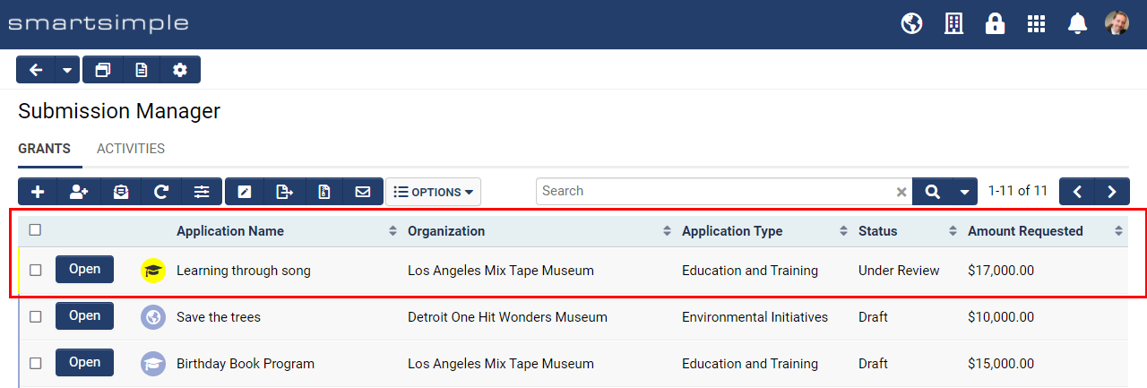
| Heading Background | Table Header background color. Typically a version of the header color at around 15% opacity. Note the header font and background color inverse when the header of a column is clicked. The sorting icons for list views are an opacity of the Heading Font, so be mindful of accessibility standards for color contrast. |
| Top Border | Display options for the line at the top of each row in the table to give differentiation between rows. Typically set to a 1px solid FFFFFF (which is white). |
| Bottom Border | Display options for the line at the bottom of each row in the table to give differentiation between rows. Typically set to a 1px solid CCCCCC (which is a light grey). |
Configuration - Advanced
Importing/Exporting Colors and Styles
You can import and export your colors and styles settings from one environment to another, or save a copy of your colors and styles for archival purposes. For example, you can make changes and test them on your backup environment and when you are happy, apply all your changes at once to your production environment system.
How to export and import colors and styles between systems
- Click on the Menu icon which looks like 9 squares in the top right of the header.
-
- Select Global Settings.
- Click on the Branding tab.
- Click the Colors & Styles link.
- In the action bar located near the header click on the Export Styles button.
- A modal window will open. Copy the code in the modal window.
- Go to the system where you want to apply these styles.
- Follow steps 1 to 4 above.
- In the action bar located near the header, click on the Import Styles button.
- Paste the styles you copied into the modal window of the desired system.
- Click the Import Styles button on the bottom of the modal window.
- Click OK on the alert.
- Close the modal window.
- Click Save.
- Force a cache refresh on your browser (CTRL + F5 on the PC, Cmd + R on Mac) to view your changes.
Sample colors and styles file
Here is a sample color and styles file you can download and import into your system. It will give you a blue header like the screenshots in this wiki.
Tip: Uploading images
When you upload images to your system, always size the images to the desired dimensions and save to the desired file format with compression. Image optimization is typically done in photo editing software such as Adobe Photoshop. Take the time to ensure your image files are 1 MB or less. Larger images can take several seconds to download and may cause a noticeable delay while pages load.
Note an image saved a 72 pixels per inch (ppi), 240 ppi and 500 ppi will all look the same if viewed at 200 pixels by 200 pixels. The quality of each version of image is exactly the same when viewed on screen. The higher ppi versions have a much higher file size which means your users may have to wait unnecessarily and use more data, but the higher ppi makes no difference to image quality on screen. So, if the image you are uploading is intended to be printed in a PDF, then a higher resolution is ok such as 150 or 300 dpi (dots per inch), but if the image is going to be used as a background in a portal or the login page a smaller resolution such as 72 ppi is recommended.
In regards to file formats JPG and PNG are the best options for your system.
JPG/JPEG Joint Photographic Experts Group is a lossy format best for images of people, landscapes, and realistic photography.
PNG Portable Network Graphics is a lossless format that supports transparency and is best suited for logos, graphics, and icons.
Tip: Sourcing imagery
Don’t have photos to use in your system? Here are some websites that offer copyright-free stock photos for commercial use. Find the images you want, crop and size the images then upload them into your system.
You may also want to check out the following paid stock photo sites.
For free icons
