BI Dashboard
Revision as of 09:41, 10 July 2017 by Ciaran Donnelly (talk | contribs)
Revision as of 09:41, 10 July 2017 by Ciaran Donnelly (talk | contribs)
The BI Dashboard is a pre-defined dashboard for simple business intelligence.
It allows users to easily create a 6-chart dashboard, helping to visualise and analyse data.
Contents
Configuring BI Dashboard
- Navigate to the relevant UTA and access the UTA Settings - General tab.
- Click on the BI Dashboard hyperlink.
- Click on New BI Dashboard button.
- Populate relevant fields in the New BI Dashboard Settings page. The settings include
- Name: name of the dashboard
- Description: description of the dashboard
- Record Filtering - Status Filter: data displayed on the dashboard will be based on the records with the selected statuses
- Record Filtering - Type Filter: data displayed on the dashboard will be based on the records with the selected types
- Chart Fields - Start Date: select field that will show the different Start Dates for the returned data
- Chart Fields - End Date: select field that will show the different End Date for the returned data
- Chart Fields - Fields to Group By: select a set of fields that you wish to aggregate the charts through
- Chart Fields - Fields to Measure: select a set of fields to use as measurements in the charts
- Chart Fields - Address in Map Panel: option to display details in the BI dashboard based on either Client address and Owner address
- Click Save.
- The Link to Dashboard field will now be populated. This link can be used to configure home pages or provide direct access to the BI Dashboard.
BI Dashboard sections
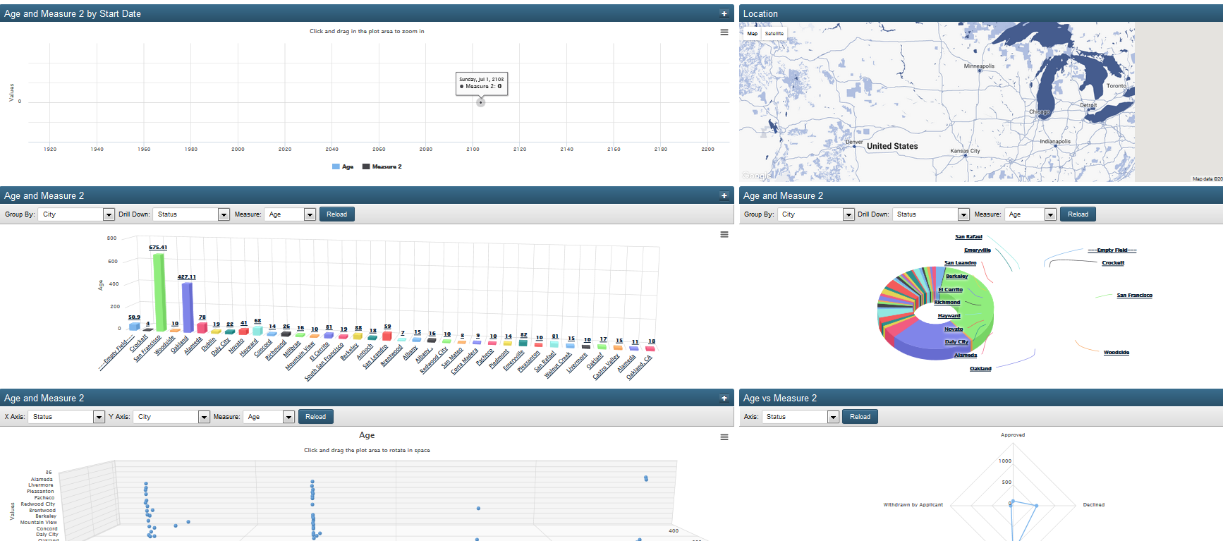
The BI Data Dashboard provides 6 charts as follows . . .
- Line chart: displays measure 1 or 2 for individual level one records, based on the Start Date. Users can click and drag to zoom in to view information specific to a certain period or date range. Users can then click on the Reset zoom option to return to the original chart. Users can also click on the Measure options under the chart to hide or expose the line for that specific measure.
- Location: map showing the Companies associated with the level one record, based on primary address. Companies with similar locations are counted and grouped within coloured circles. Users can click on the circles or use the zoom in feature to get more granular data.
- Bar chart: showing totals for measure 1 or 2, based on selected groupings of level one records. There are drop-downs to allow users to change the Group By, Drill Down and Measure options, and a Reload button to regenerate the chart based on the new options. Users can also click into the individual groupings to get more granular information and can return to the original chart by clicking on the Back to Total button.
- 3D Donut chart: showing totals for measure 1 or 2 based on selected groupings of level one records. There are drop-downs to allow users to change the Group By, Drill Down and Measure options, and a Reload button to regenerate the chart based on the new options. Users can also click into the individual groupings to get more granular information and can return to the original chart by clicking on the Back to Total button.
- Scatter plot: use horizontal and vertical axes to plot data points for individual level one record. There are drop-downs to allow users to change the Group By, Drill Down and Measure options, and a Reload button to regenerate the chart based on the new options. Users can also click into the individual groupings to get more granular information and can return to the original chart by clicking on the Back to Total button.
- Spiderweb chart: two-dimensional chart of three quantitative variables represented on axes starting from the same point. There is a drop-downs to allow users to change the Axis, and a Reload button to regenerate the chart based on the new option. Users can also click on the Measure options to the right of the chart to hide or expose the line for that specific measure.
Expanding individual chart
All 6 of the charts have a small plus sign in the top right hand corner.
When it is clicked then the chart expands so that it fills the entire window. The plus sign changes to a minus sign.
When the minus sign is clicked then the chart resizes back to its original size, and all 6 charts are exposed again.
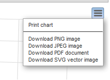
All 6 of the charts have a Chart context menu in the right hand side of the graph.
The Chart Context menu provides user with the ability to download or print the chart.

