Difference between revisions of "Usability"
Mark Bridger (talk | contribs) (→1. Visibility of System Status) |
Mark Bridger (talk | contribs) (→2. Match Between the System and Real World) |
||
| Line 65: | Line 65: | ||
===2. Match Between the System and Real World=== | ===2. Match Between the System and Real World=== | ||
| − | + | If I presented you with two labels, “staff directory” and “meet and greet” would you know what you will get if you click “meet and greet”? Familiar language make things easier for your users to understand. | |
| − | If I presented you with two labels, “staff directory” and “meet and greet” would you know what you will get if you click “meet and greet”? Familiar language make things easier for your users to understand. | + | [[File:Usability-meet.png|thumb|none|400px|Use familiar language]] |
Follow conventions, use previews and present information in a logical order. | Follow conventions, use previews and present information in a logical order. | ||
Revision as of 14:46, 19 August 2020
Contents
- 1 Overview
- 2 Usability – Essentials
- 2.1 What is UI?
- 2.2 What is UX?
- 2.3 What is a usability issue?
- 2.4 How can I test for usability issues?
- 2.5 What are the 10 Heuristics?
- 2.5.1 1. Visibility of System Status
- 2.5.2 2. Match Between the System and Real World
- 2.5.3 3. User Control and Freedom
- 2.5.4 4. Consistency and Standards
- 2.5.5 5. Error Prevention
- 2.5.6 6. Recognition Rather Than Recall
- 2.5.7 7. Flexibility and Efficiency of Use
- 2.5.8 8. Aesthetic and Minimalist Design
- 2.5.9 9. Help Users Recognize, Diagnose and Recover from Errors
- 2.5.10 10. Help and Documentation
- 2.6 How do I ensure my system is and stays user-friendly?
Overview
Usability is a metric used to assess a User Interface design. An interface is considered usable if it is perceived as easy, enjoyable, efficient and effective to use and learn.
This article provides information on how you test for usability issues in your system.
Usability – Essentials
What is UI?
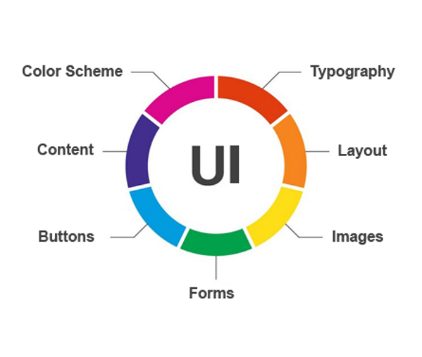
UI or User Interface, is a series of screens with elements such as buttons, icons and text you interact with.
If you move a custom field, add a button, or change a color you are modifying the User Interface.
When we talk about UI we ask:
- Is there enough color contrast?
- Is the content concise and easy to read?
- Is the layout well organized with enough white space?
- Are the pages responsive?
- Does it work with assistive technology?
What is UX?
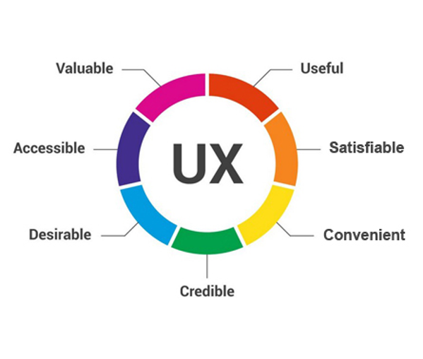
The term UX, encompasses all aspects of the user's interaction with the company, its services, and its products.
UX is how you feel buying, opening, using, and disposing of a product/service.
If you make your application process easier/quicker, you are improving the UX.
When we talk about UX, we ask:
- Can I do what I came to do easily, quickly and simply?
- Do I actually want to use this product/service?
- Do I trust and appreciate this product/service?
What is a usability issue?
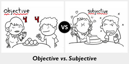
A usability issue, is any issue that prevents the system from being easy, efficient and effective to learn and use. Usability issues are objective, such as contrast ratio of text on a background. Usability issues are not subjective or based on personal preference, such as “I don’t like orange”.
How can I test for usability issues?
There are established standards called Heuristics that are used to evaluate the usability of a user interface design.
These 10 heuristics summarized below are a tool for discovering usability issues in a user interface.
You can also learn more about these heuristics at https://www.nngroup.com/articles/ten-usability-heuristics/
What are the 10 Heuristics?
The 10 heuristics used to evaluate the usability of a user interface design are as follows:
1. Visibility of System Status
Think about an elevator, I press the button and it lights up. I know the elevator is coming. I look up and see how long I have to wait until the elevator arrives.
Let people know what is going on with appropriate feedback. Do your users know what is going on, what is expected of them, and what will happen next?
You can meet these criteria by:
- Showing progress (how far have you gone and what is left)
- Showing space/time (how much space/time is left)
- Showing change (draw attention to things that have changed)
- Showing expected actions (tell me what I need to do next)
2. Match Between the System and Real World
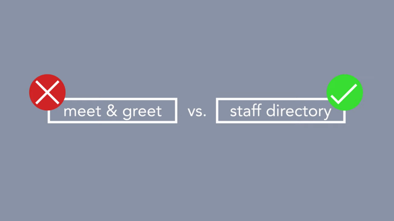
If I presented you with two labels, “staff directory” and “meet and greet” would you know what you will get if you click “meet and greet”? Familiar language make things easier for your users to understand.
Follow conventions, use previews and present information in a logical order. Ask yourself, is the information presented in a way that is logical, understandable and the way the user expects to see it?
You can meet these criteria by:
- Using familiar words, phrases, concepts and metaphors
- Following conventions
- Presenting information in a logical order
- Providing a preview or showing the world in miniature
3. User Control and Freedom
Make sure users can go forward and back in any process and make sure they can see the information the way they need. Ask yourself: can I easily find the information I am looking for in the way I need to see it?
You can meet these criteria by:
- Providing a path forward and back (undo/redo)
- Providing different ways to explore information (searching, filtering, viewing options)
4. Consistency and Standards
Make sure buttons and links are named the same thing, are located in the same place, and put where they are expected to be. Ask yourself: do I know where to find desired links and buttons, do I know what they do, and are they always in the same place?
You can meet these criteria by:
- Keeping links, buttons and information in the same order and in the same place
- If you have multiple ways to do an action or go to the same place, make sure you use the same caption for your links and shortcuts
5. Error Prevention
Prevent errors by providing more information, add instructions, check for error conditions, and refine your process. Ask yourself: what are common errors with my process and how can I help prevent others from encountering these?
You can meet these criteria by:
- Providing needed information and warnings, so users know what to do
- Make sure links and button captions say what they will do (never say “click here”)
- Eliminate error-prone conditions or check for them and advise the user
- Refine your process to avoid errors
6. Recognition Rather Than Recall
Make sure all the information and instructions needed to complete an action are available. Ask yourself: are all instructions and information I need available so I can take the appropriate action?
You can meet these criteria by:
- Making objects, actions, options and directions visible or easily retrievable
- Not forcing the user to remember anything or think
- Avoiding codes and hurdles
- Providing visual representations
7. Flexibility and Efficiency of Use
Help users accomplish their goals faster by adding shortcuts and default options. Ask yourself: can we help the user accomplish their goals faster and with less effort?
You can meet these criteria by:
- Adding shortcuts to commonly used functionality
- Providing default options
- Using list views with options where possible
8. Aesthetic and Minimalist Design
Make sure what the user came to see or do is visible and clear, and eliminate anything that may distract them. Ask yourself: is it clear what I am supposed to do and is there anything distracting me from completing my task?
You can meet these criteria by:
- Keeping important information above the fold (initial viewable area)
- Minimizing signal-to-noise ratio
- Being judicious with color
- Removing redundant information (keep it concise)
9. Help Users Recognize, Diagnose and Recover from Errors
Help users understand and fix errors with clear messaging that explains the problem and how they should resolve the error. Ask yourself: when I encounter a problem, do I know what I did wrong, and how to fix it?
You can meet these criteria by:
- Ensuring clarity of messaging and use plain language
- Always providing or suggest a solution
- Educating the user (what is happening and why)
- Providing a path forward
10. Help and Documentation
Help users understand what is expected of them and how to do it by including context-sensitive instructions, highlighting new features and changes in functionality. Ask yourself: is my help documentation where it is needed, can my users understand what they need to do and are my users aware of new functionality and changes?
You can meet these criteria by:
- Providing context-sensitive help
- Providing examples and recommendations
- Pointing out new or changes to functionality
- Guiding with additional information
- Listing concrete steps to be carried out
- Being short and concise
How do I ensure my system is and stays user-friendly?
Whether you are making changes to your system or you have a team making changes for you, always use the above heuristics to test the work. If you find an issue, bring it up with your team or call support. Most issues can be resolved through configuration, but if you encounter something that is not, raise an enhancement ticket and help make SmartSimple better for everyone. Help for specific issues and features can also be found on the wiki.


