Difference between revisions of "Creating Charts and Dashboards - Overview"
Julia Decker (talk | contribs) |
(No difference)
|
Revision as of 10:04, 6 December 2007
You can associate charts with reports to provide the user with a visual representation of the data used in the report. When converting a report into a chart you can:
- Create multiple charts of different types for the same report.
- Link multiple charts to the visual dashboard.
- Link a chart to the pin board.
- Embed a chart through a custom field to some other object. For example, a year-to-date sales chart can be lined to each sales person’s profile.
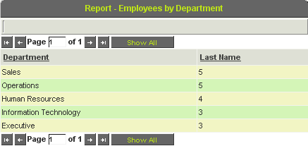
1. Review the Employees by Department report.
2. Close the preview.
3. Edit the Report.
4. Click the Charts tab.
The list of charts is displayed – currently blank until you add some charts.
You can add any number of charts of different types to a single report.
5. Click the New Chart tab.
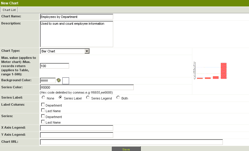
The Chart Window is displayed.
This page consists of the following settings:
- Chart Name - Name for this chart. By default this name is taken from the report name.
- Description - Narrative description of the chart. By default this description is taken from the report description.
- Chart Type - Choose from Bar Chart, 3D Bar Chart, Pie Chart, 3D Pie Chart, Meter, Area, Line, and Table.
- Maximum value - For a Meter chart - only determines the maximum value displayed on the Meter.
- Background Colour - Colour to be displayed behind the chart.
- Series Colour - Colours to be used for each series in the chart.
- Series Label - The format of any labels required for the series.
- Label Columns - The report columns to be used for the label column.
- Series - The report columns to be used as the data series for the report.
- X Axis Legend - Test legend for the horizontal X Axis.
- Y Axis Legend - Test legend for the vertical Y Axis.
- Chart URL - A generated URL that can be used to embed the chart in a custom field or on the clipboard.
6. Set the Chart Type to Pie Chart.
7. Set the Series Label to Both.
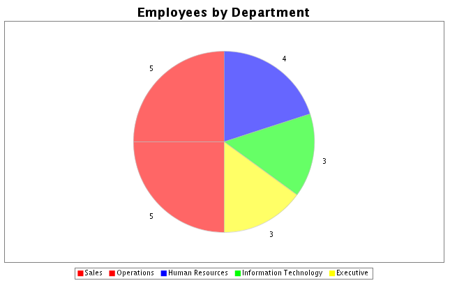
This will display a Series legend below the pie chart and the value of each pie segment next to the segment.
8. Set the Label Column to Department.
Each section of the pie chart will be labeled with the department name.
9. Set the Series to Last Name.
The numeric values in the Last name column will be used to specify the size of each pie segment.
10. Click the Save button.
The URL is added to the Chart URL box and the Preview button is now displayed.
11. Click the Preview button.
The Pie chart is displayed in a separate window.
12. Close the Preview window.
13. Click the Chart List tab.
The new chart is displayed on the list.
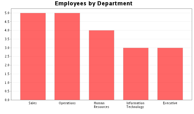
14. Create an additional chart displayed as a Bar Chart.
15. Close the Preview window.
16. Click the Chart List tab.
There are two charts on the list for the same report.


